Building trust for a local tatto studio
Giger Ink needed a brand and website that build trust fast and feel unmistakably theirs. The focus was clarity and confidence, with Instagram as the main contact channel and the website acting as a portfolio hub.
Project Overview
Outcomes
•
•
•
•
Context
Giger Ink is a tattoo studio where trust is the product. The brand needed to feel feminine, sharp, and slightly unsettling in a controlled way, while still staying readable and usable across digital and physical touchpoints.
What the project needed:
•
•
•
My role
I shaped the brand direction, built the identity assets, and designed the website experience with a focus on trust and simplicity. We tested the initial idea of an on-site booking form, then removed it to match the client’s workflow and keep the site easy to maintain.
What I did:
•
•
•
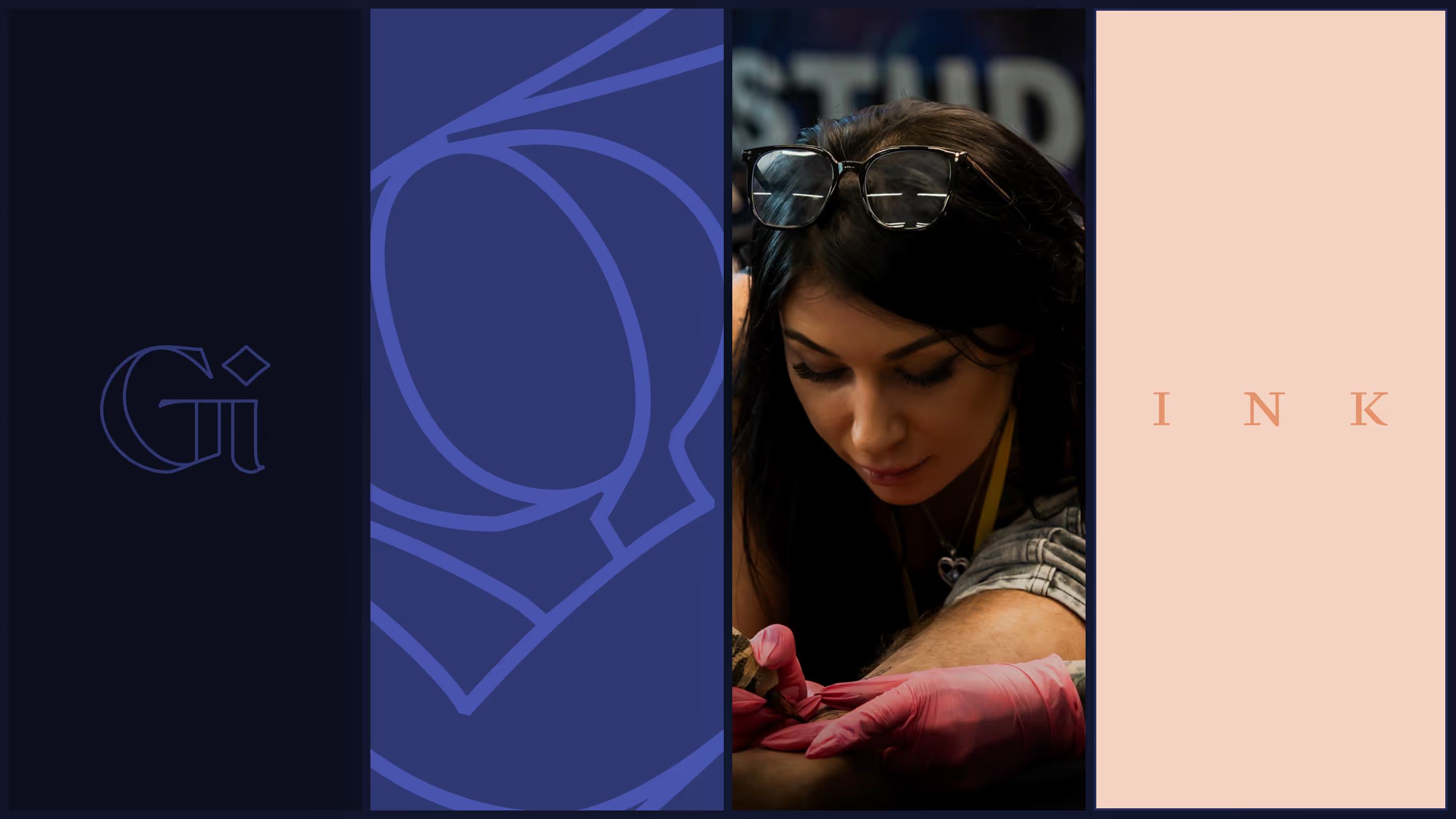
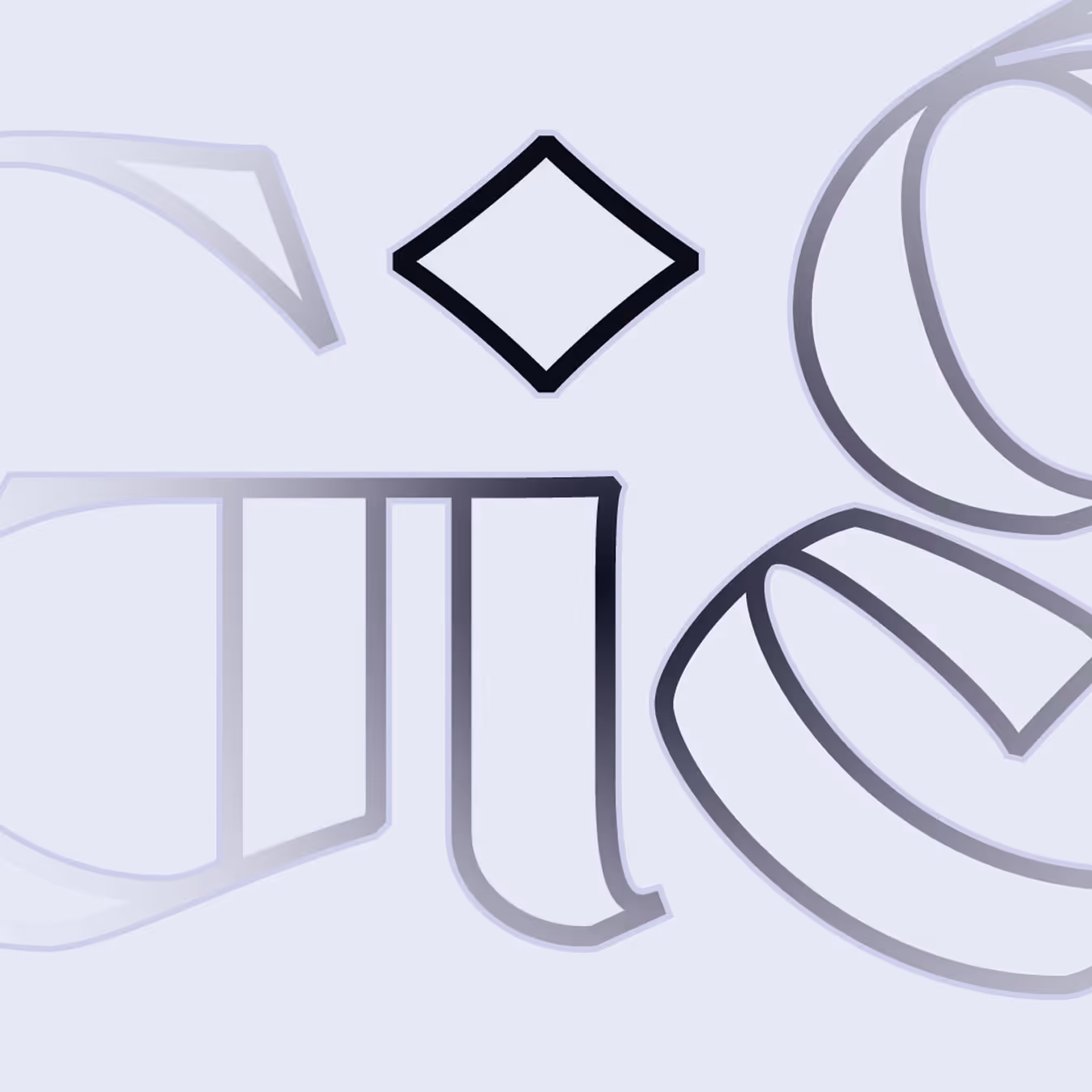
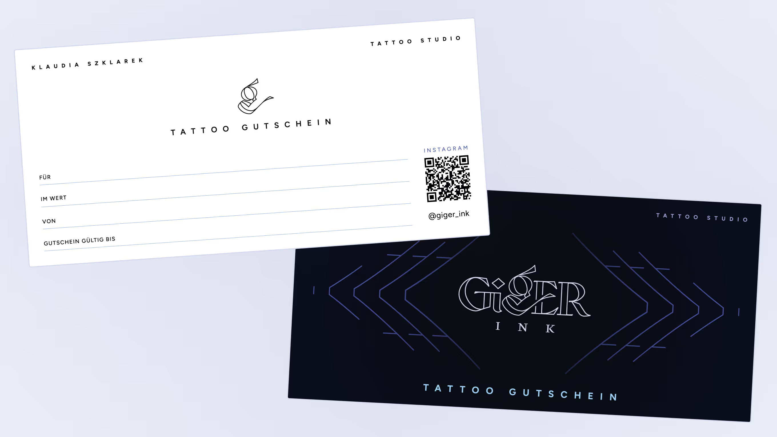
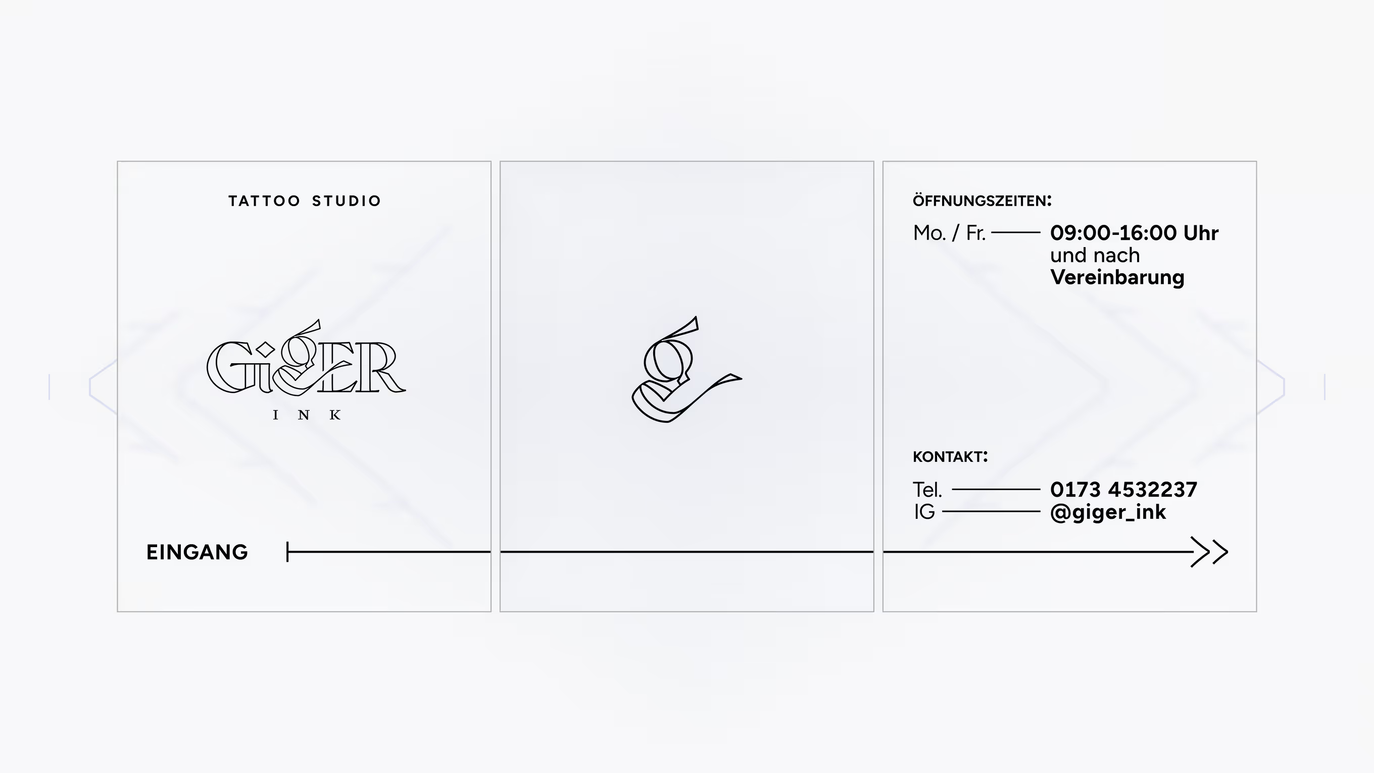
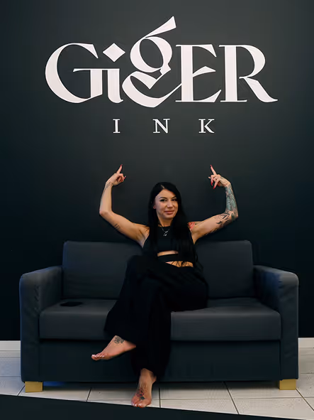
Logo
The logo needed to feel human and feminine, with a controlled edge inspired by H.R. Giger.
The result is a mark that is recognisable at a glance and strong enough to carry the studio across web, print, and storefront applications.
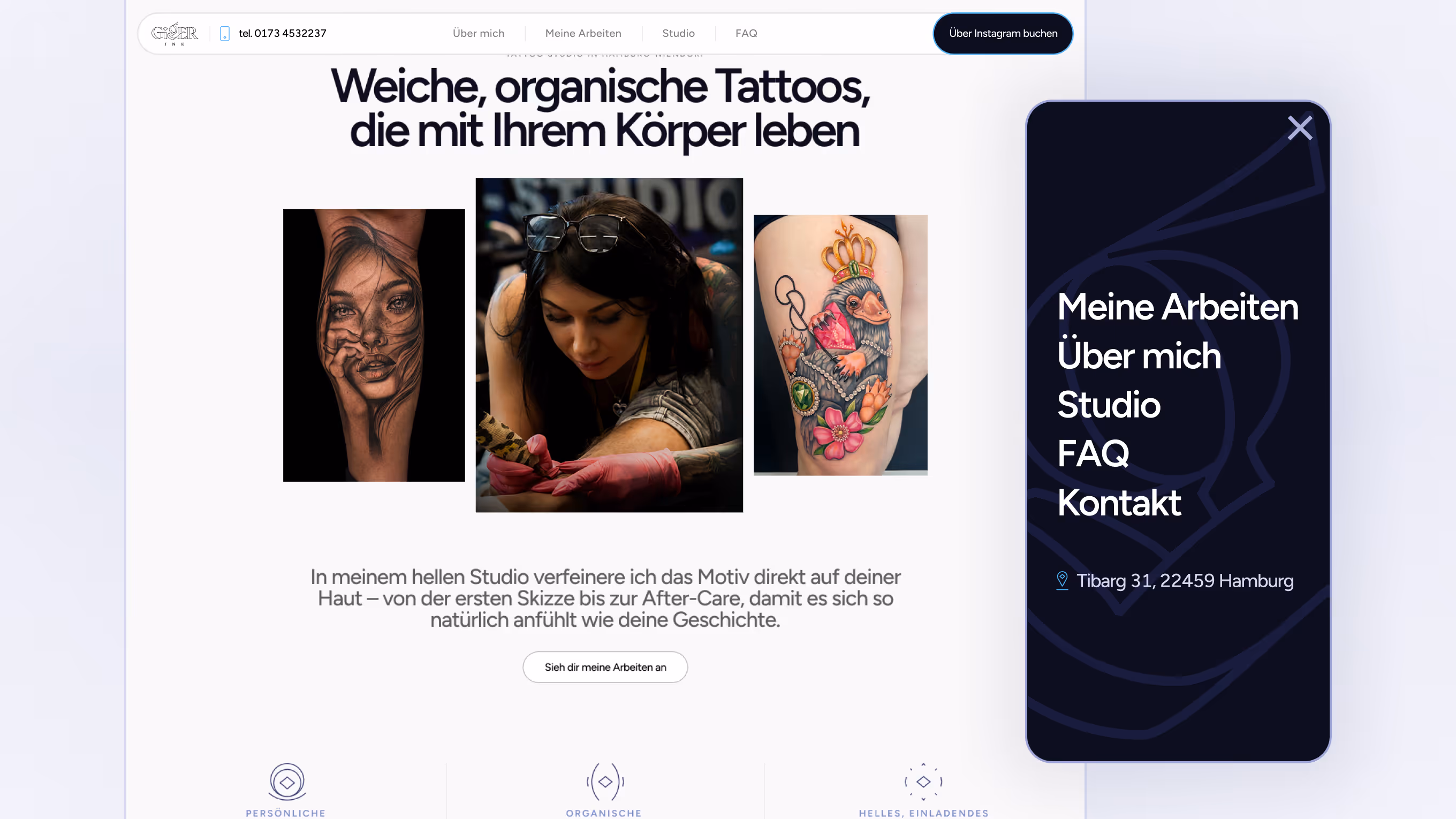
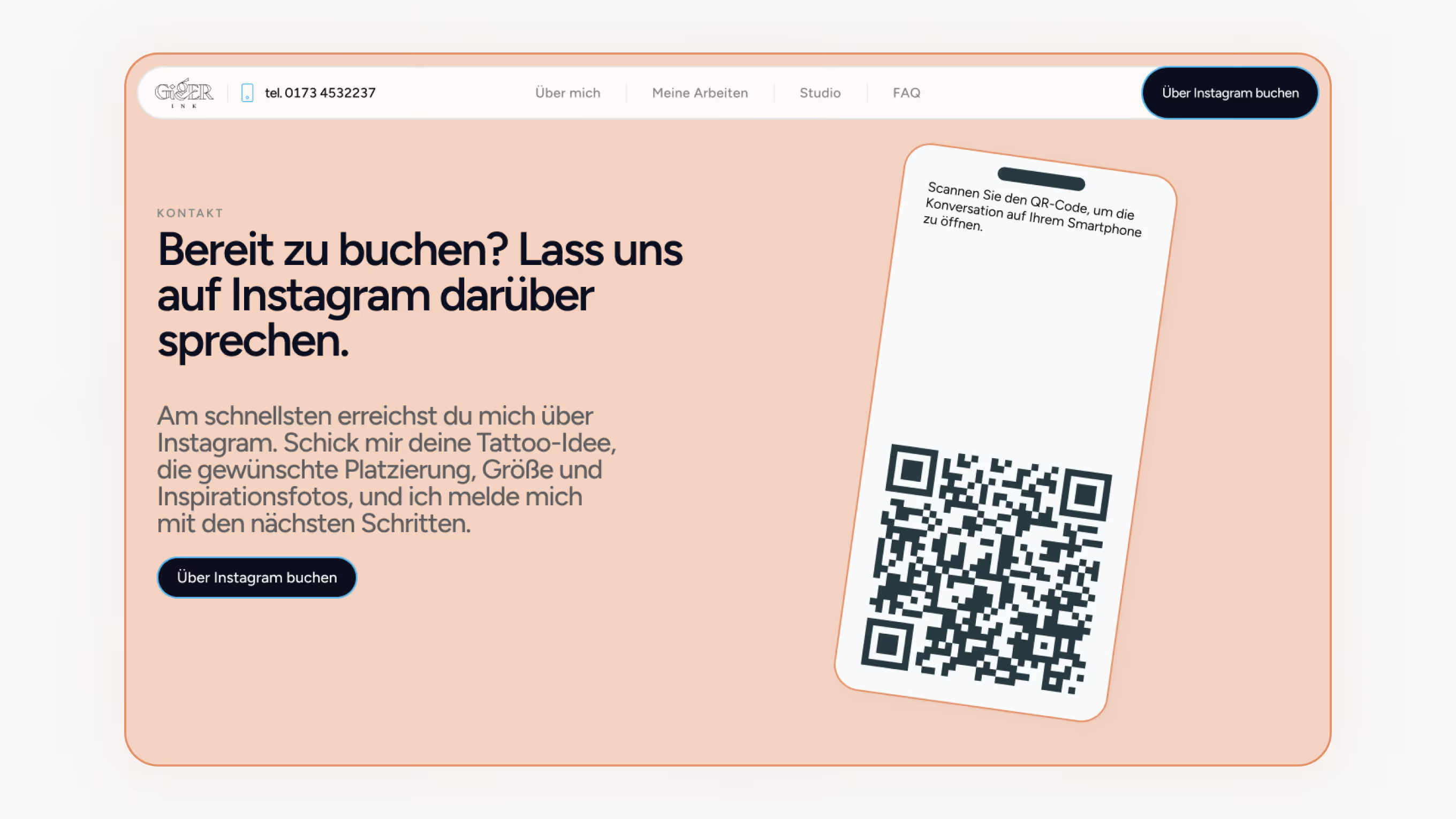
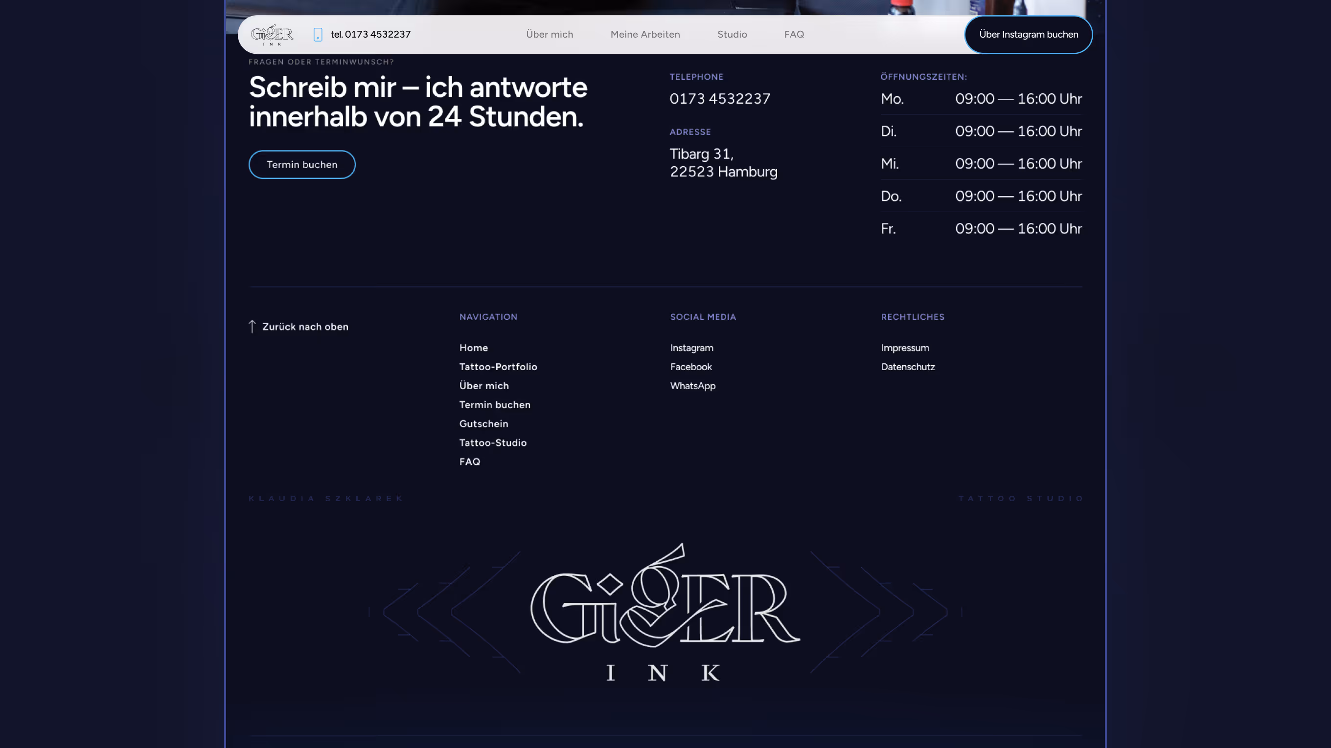
Website
The website started as a booking-first idea, but the more we mapped the client journey, the clearer it became that the priority was trust. The final site works as a portfolio hub with clear studio information and Instagram as the primary contact path.
Key decisions:
•
•
•
•
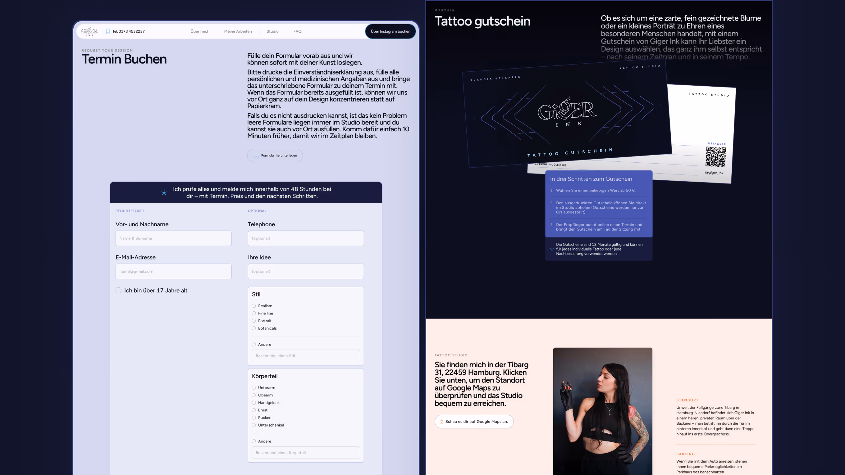
On the left the design of the form that we later removed. The homepage and navigation were built to route users quickly to work, location, and booking via Instagram.
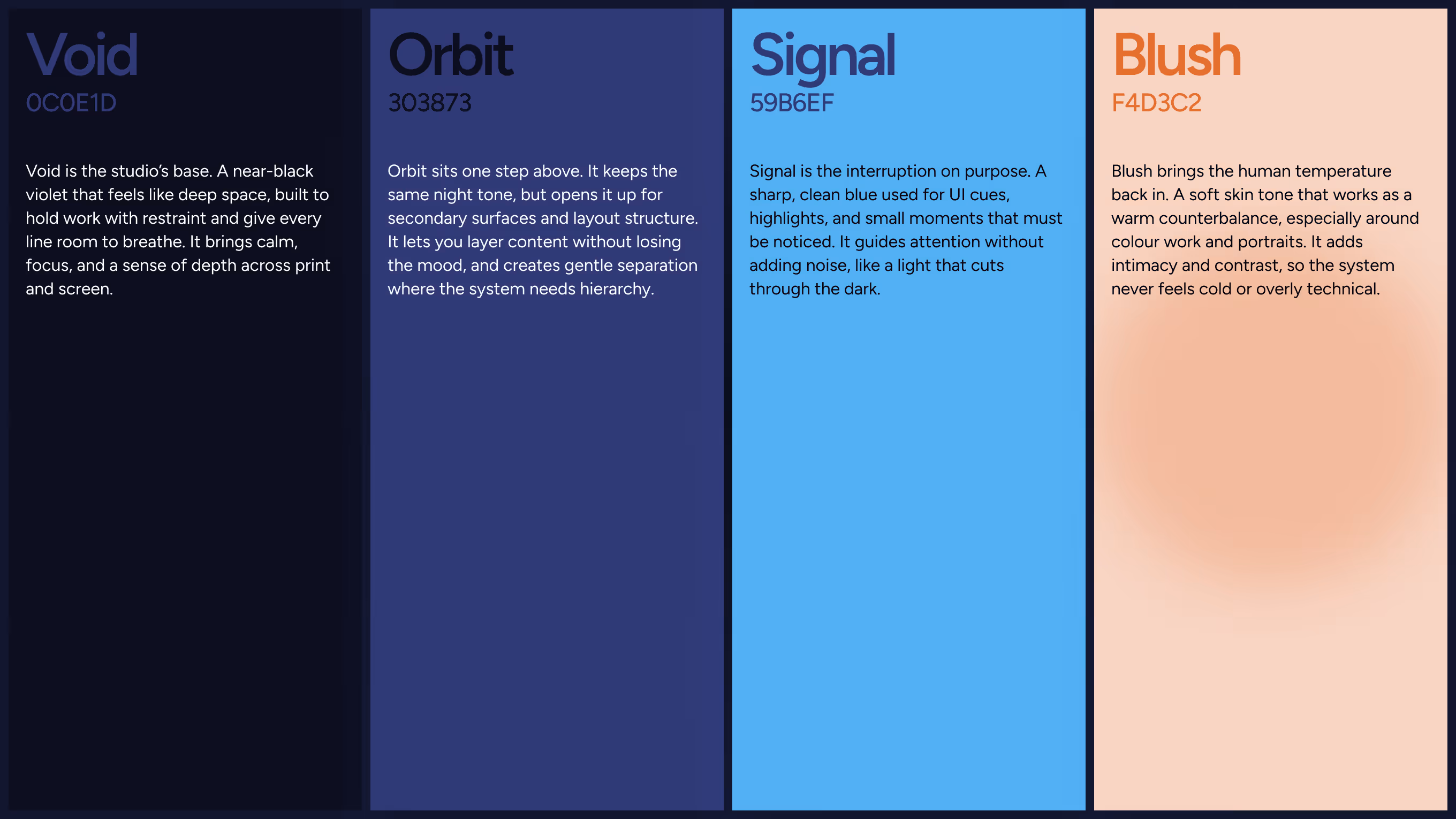
Visual Identity
The identity balances clean structure with an offbeat tone. Typography and contrast rules keep the brand readable, while details in the logotype and supporting graphics add the studio’s character.