direct contact
pawel.skotnick@gmail.com
+48 608 672 336
Working hours
Monday–Thursday
09:00–16:00
UTC+1
09:00–16:00
UTC+1
Explore a curated selection of letter-led marks, wordmarks, symbols, and combinations built from one clear idea and finished as a usable system.
I focus on what reads fast, scales cleanly, and stays consistent across real touchpoints. If you want a logo that’s easy to apply, not just easy to like, start here.


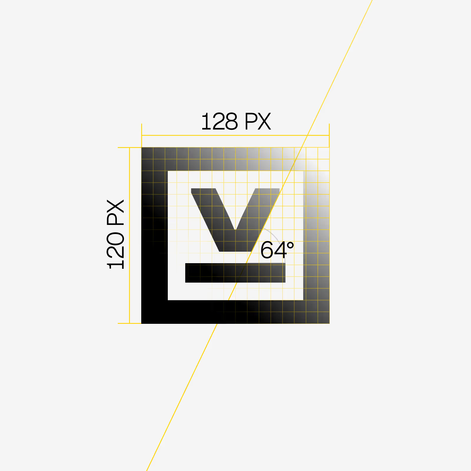
A grid-based V-mark (128×120) designed to stay crisp at any size. The V sits inside a softened rectangle (+8px in length) to balance precision with a more approachable edge for a sheet-metal machinery company.
I design letter-led marks that read fast, scale cleanly, and stay consistent across real touchpoints. You get the logo plus the rules and files needed to apply it without guessing.
Final business name, a one-line description of what you do, primary use-cases (site/social/print/signage), any must-keep elements or existing assets, and who the decision-makers are + your feedback cadence. More details listed on the Services page.
Two review rounds are included. Enough to polish the mark without turning the process into endless iterations.
Typically 3 to 6 weeks. Timing depends on scope and feedback pace.
A usable system, not just a file. You get clean exports for web and print plus a short usage guide, so your team can apply the logo confidently.
Yes. The mark is prepared for scaling, one color use, and common production needs, with formats suitable for both.
No problem. Horizontal and vertical lockups, versions with or without a tagline, and other practical variants can be included based on scope.
Both. If the brand benefits from a symbol, we build it. If clarity is the priority, we stay letter-led.
Yes, if needed. Simple launch assets can be included so the identity looks consistent from day one.