Letters
Go straight to case study:
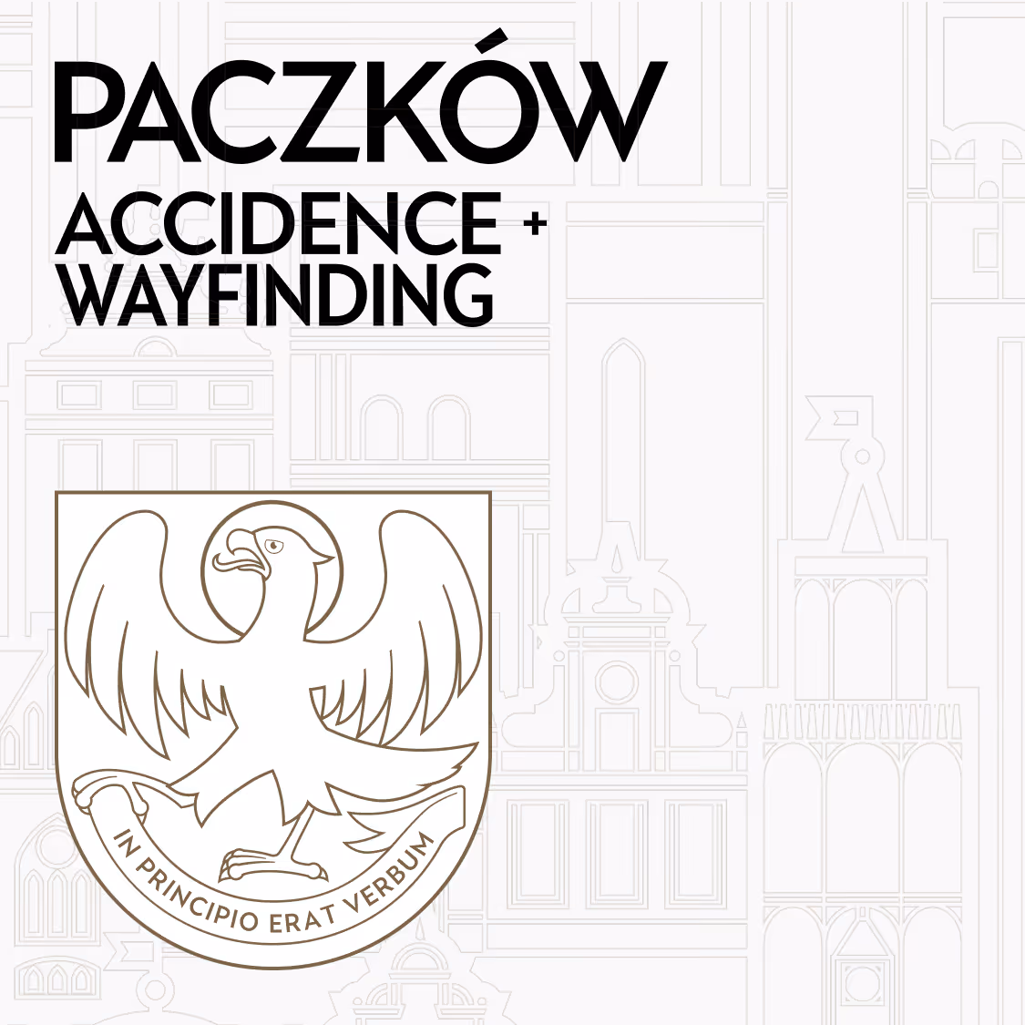
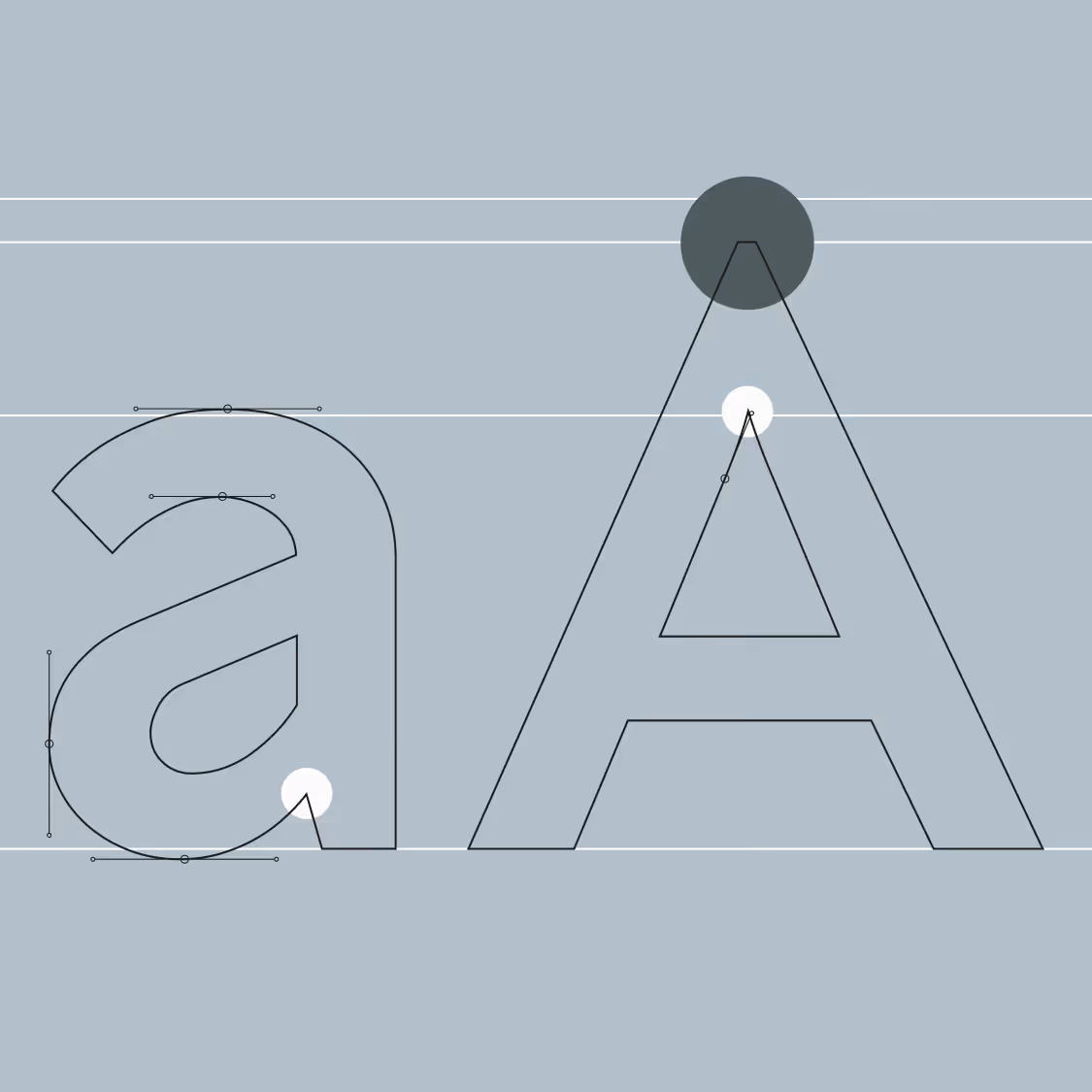
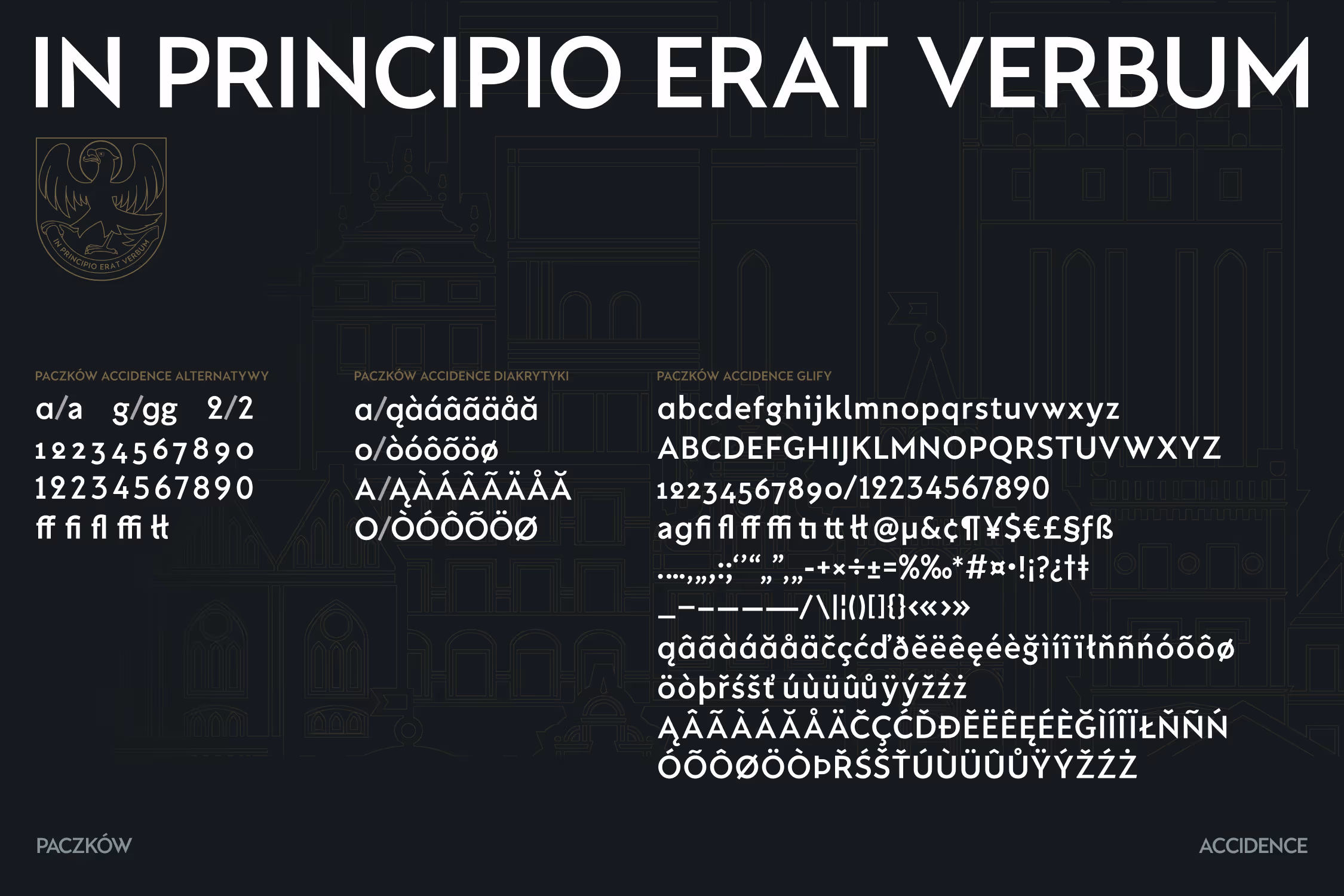
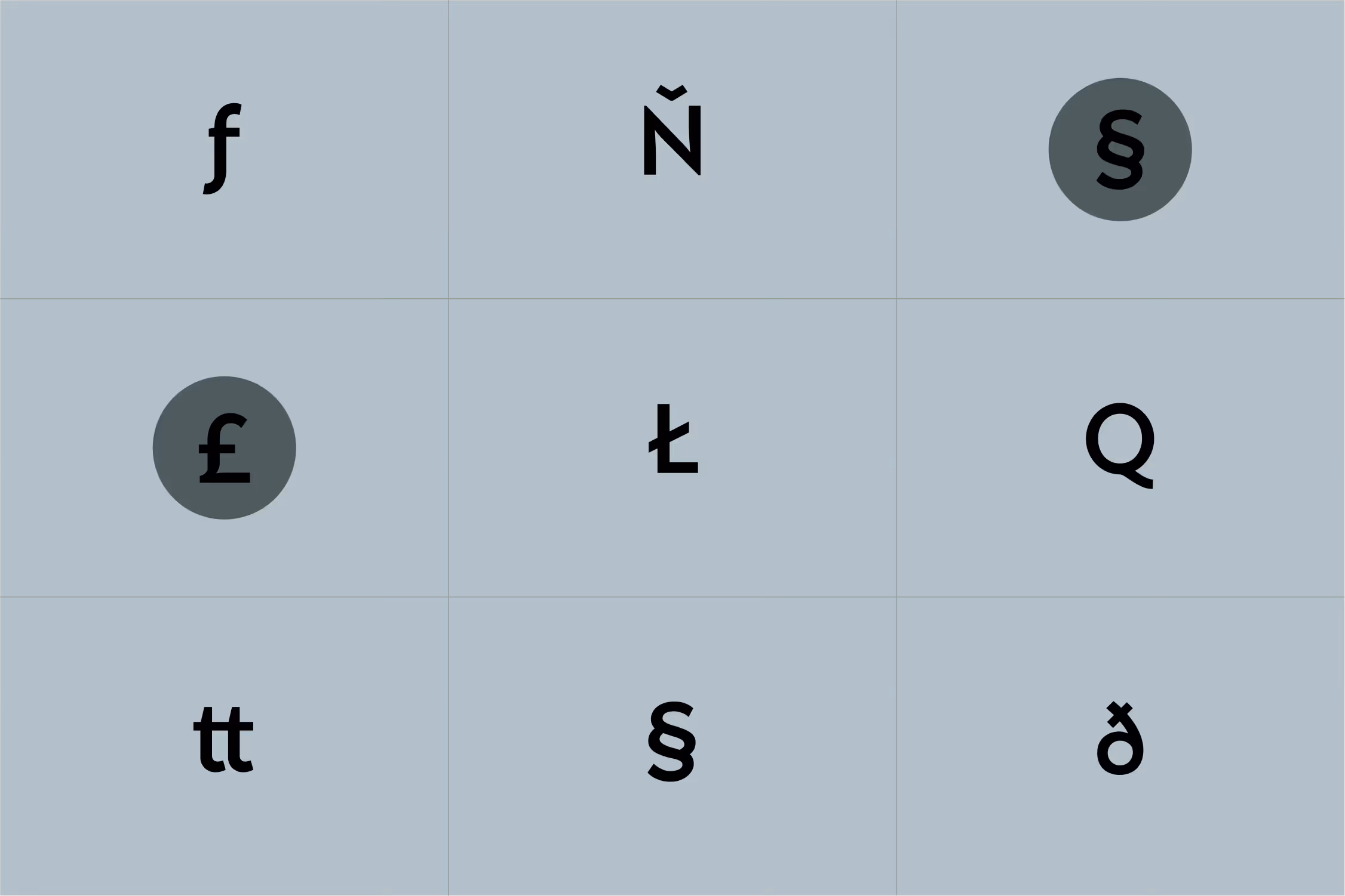
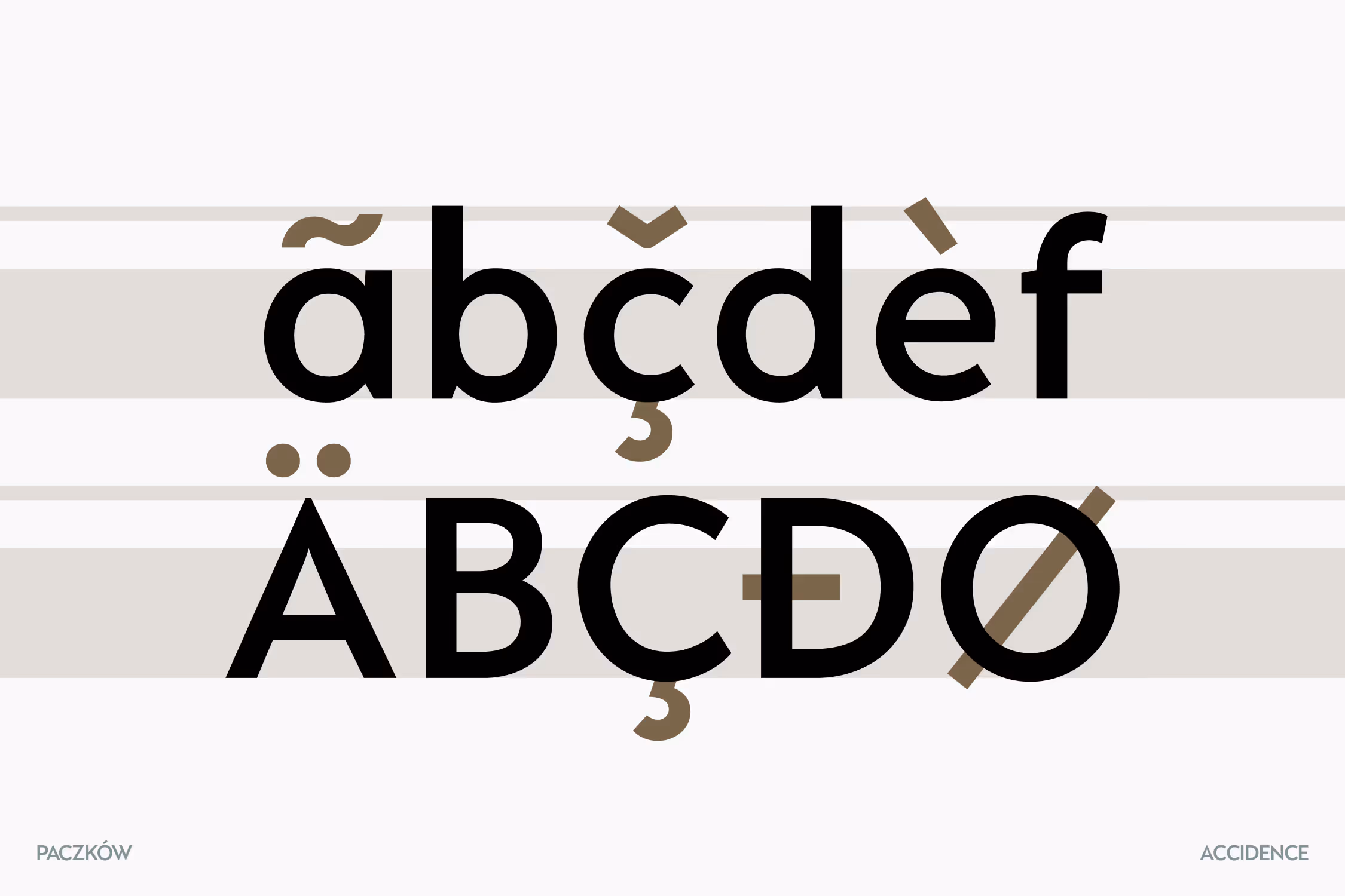
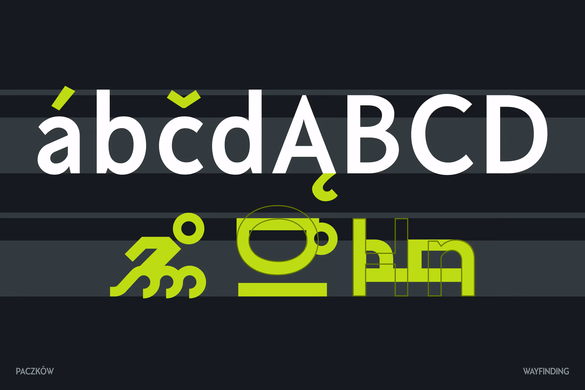
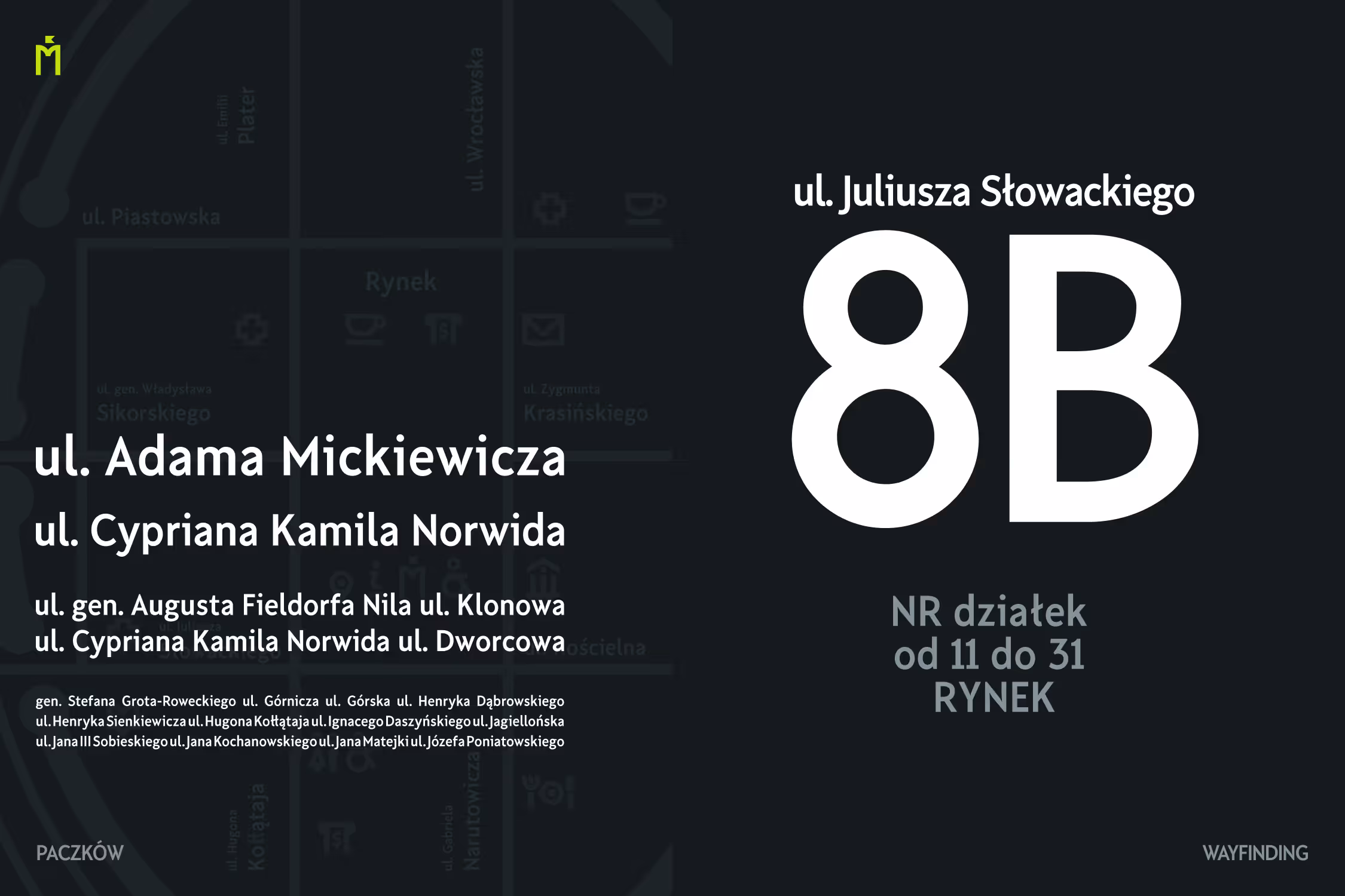
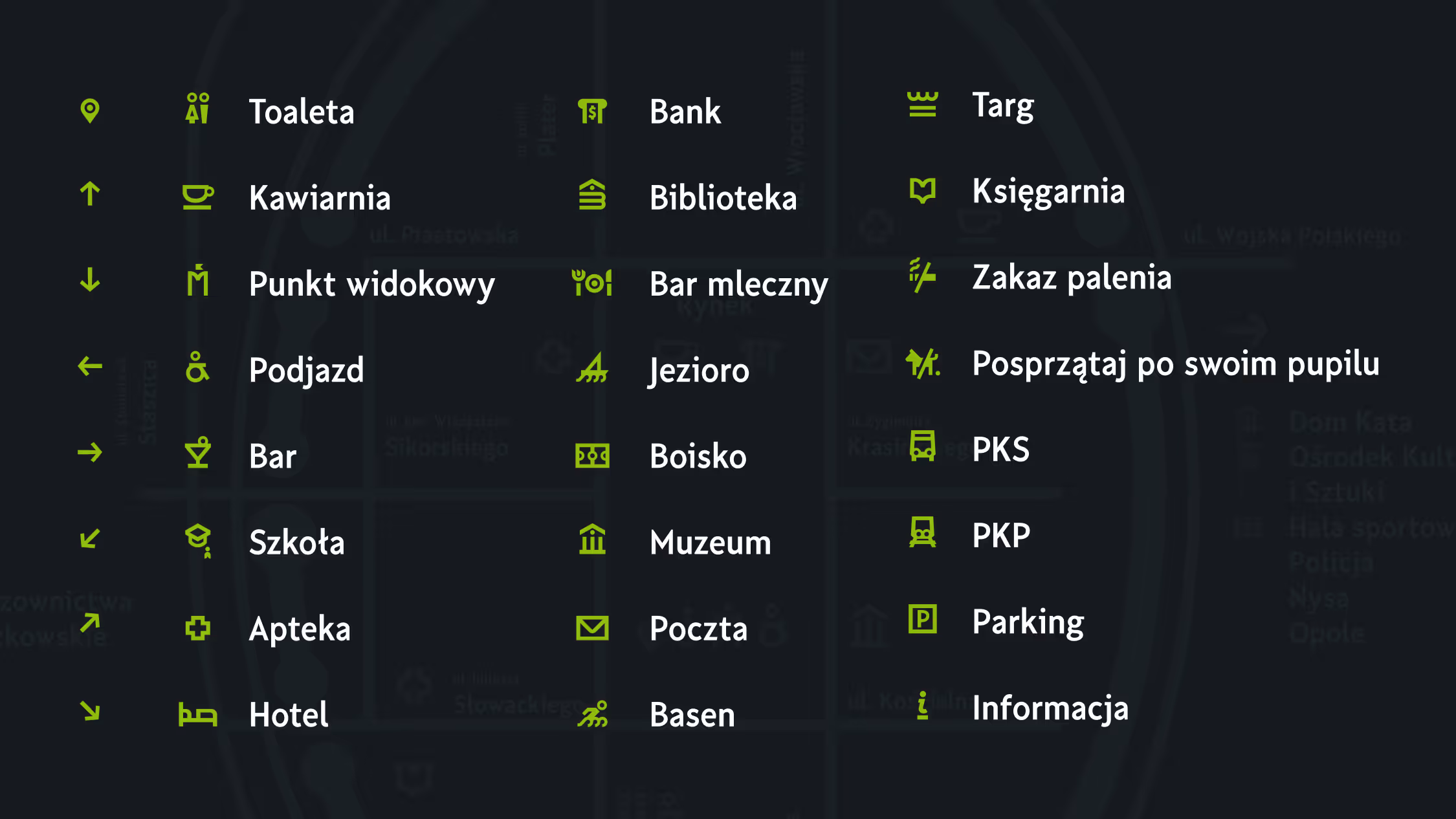
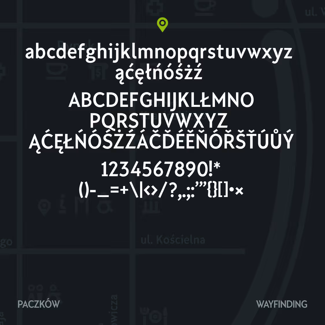
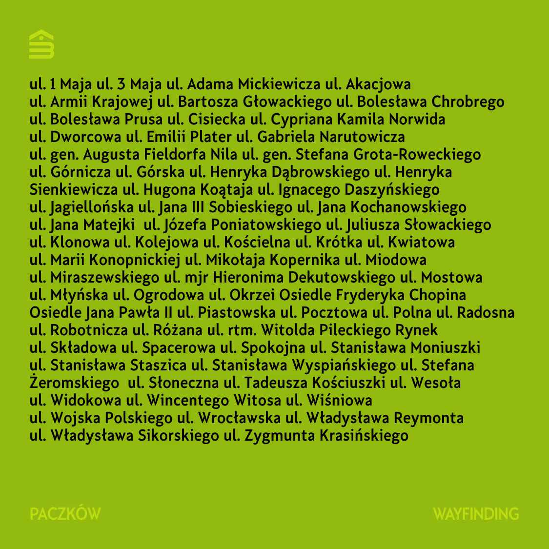
Paczków
A two-variant typeface system drawn from letterforms found on local postcards, facades, and the humanist geometry of turn-of-century printed matter. The forms are deliberately wide and heavy, mirroring the character of Paczków's architecture: preserved across centuries, but never refined beyond its own vernacular. Wayfinding is the same skeleton, compressed for street sign economy.
Had to communicate
How it was achieved
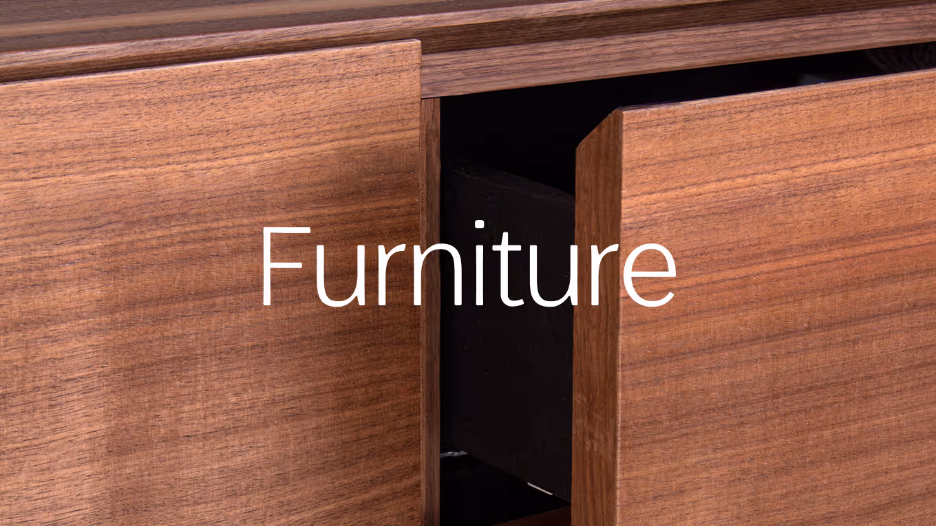
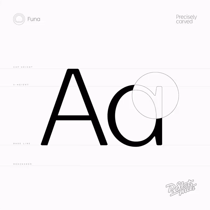
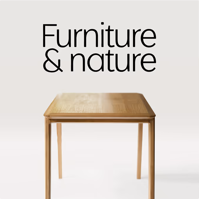
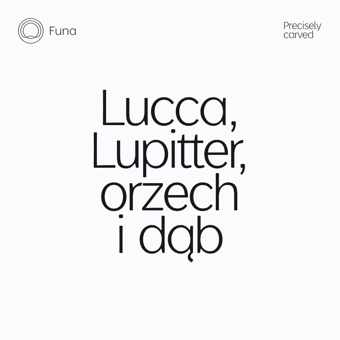
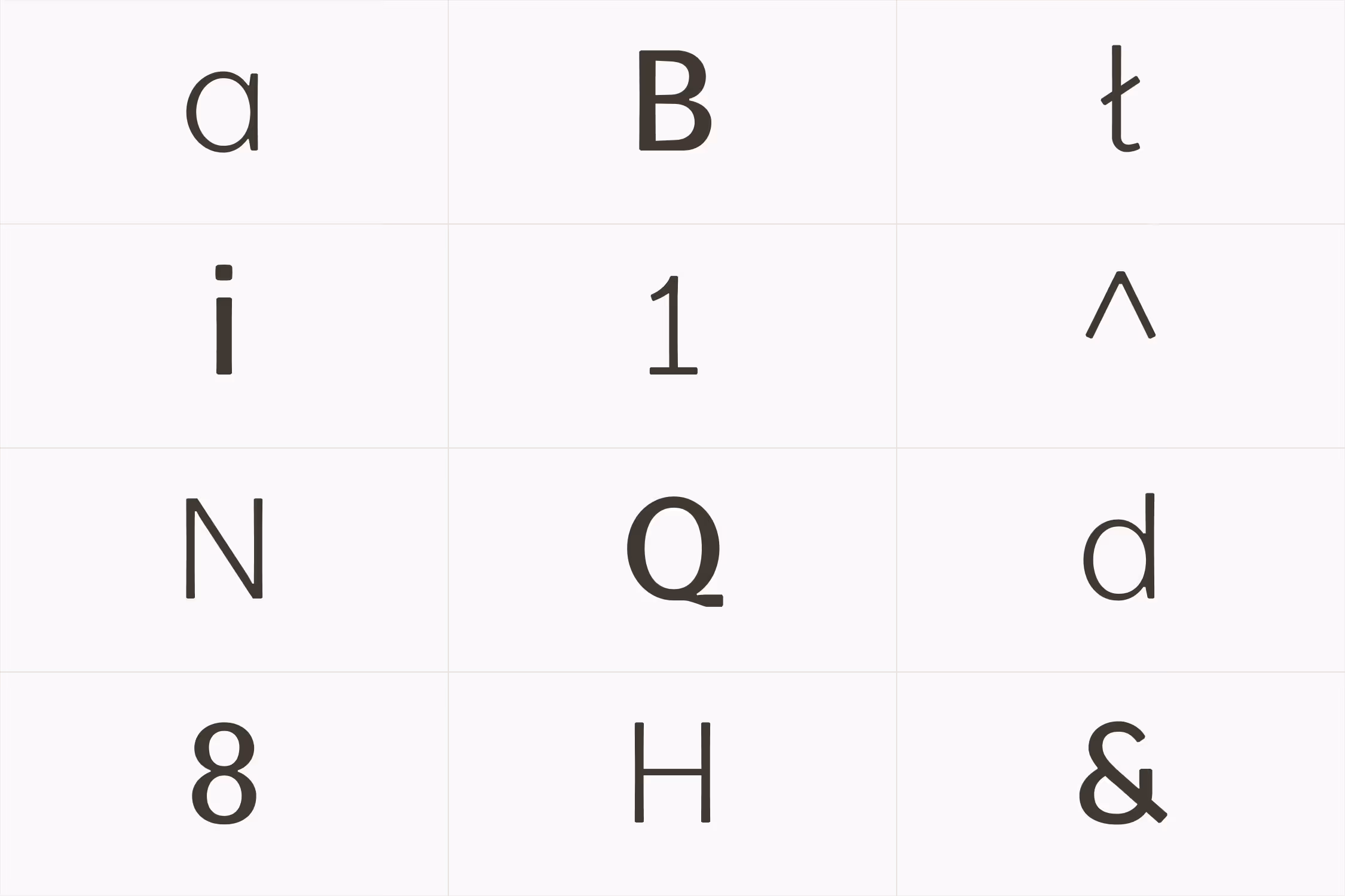
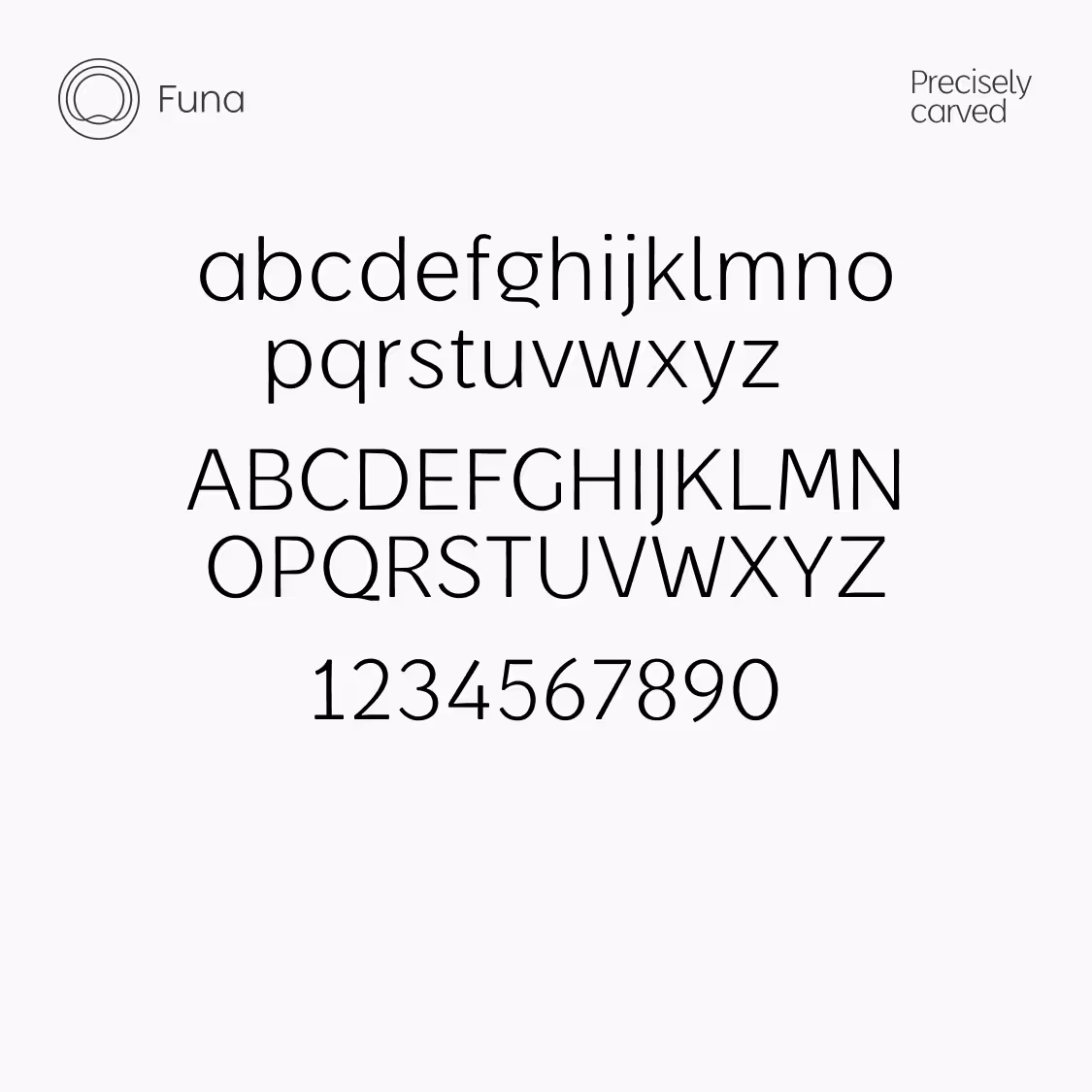
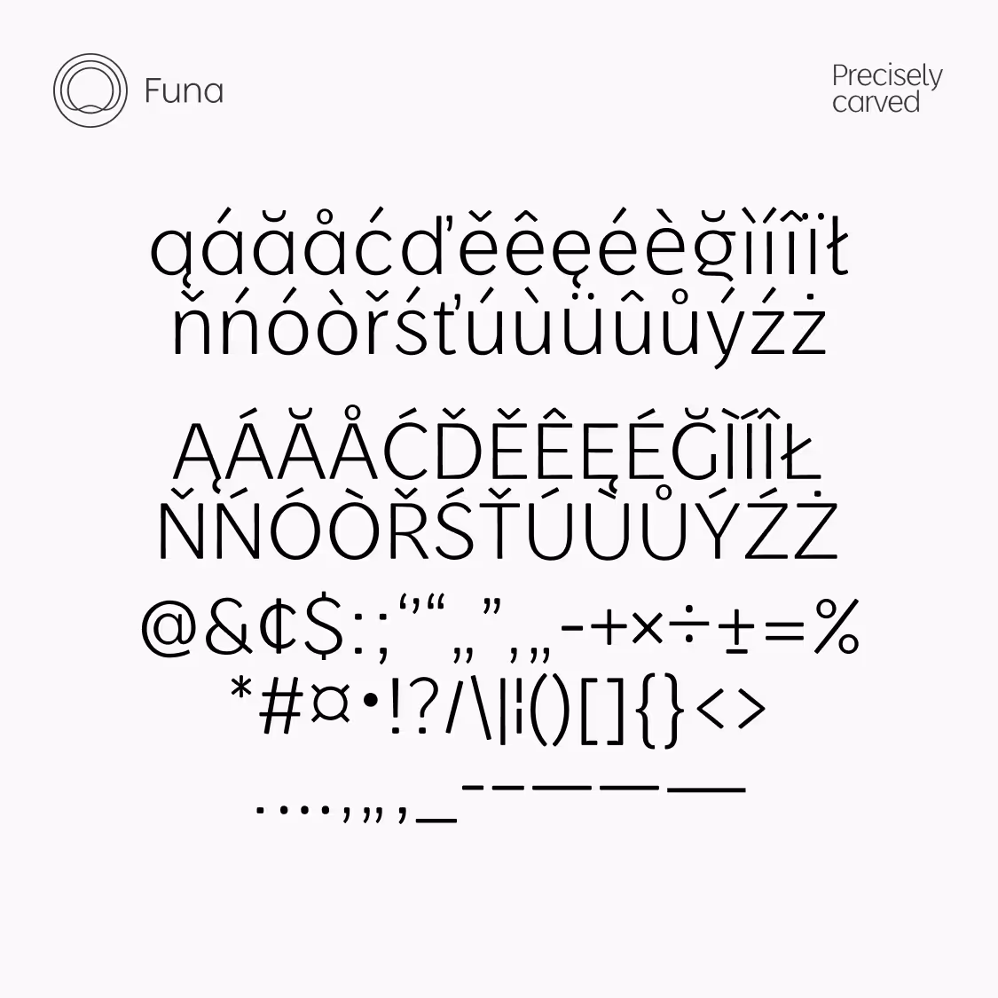
Funa
A typeface drawn from seven years of building furniture by hand. The arches follow Thonet logic: continuous, evenly distributed, with no abrupt change of direction where the form turns. Enough structure for headlines and product names, enough character to sit under the FUNA mark without competing with it.
Had to communicate
How it was achieved

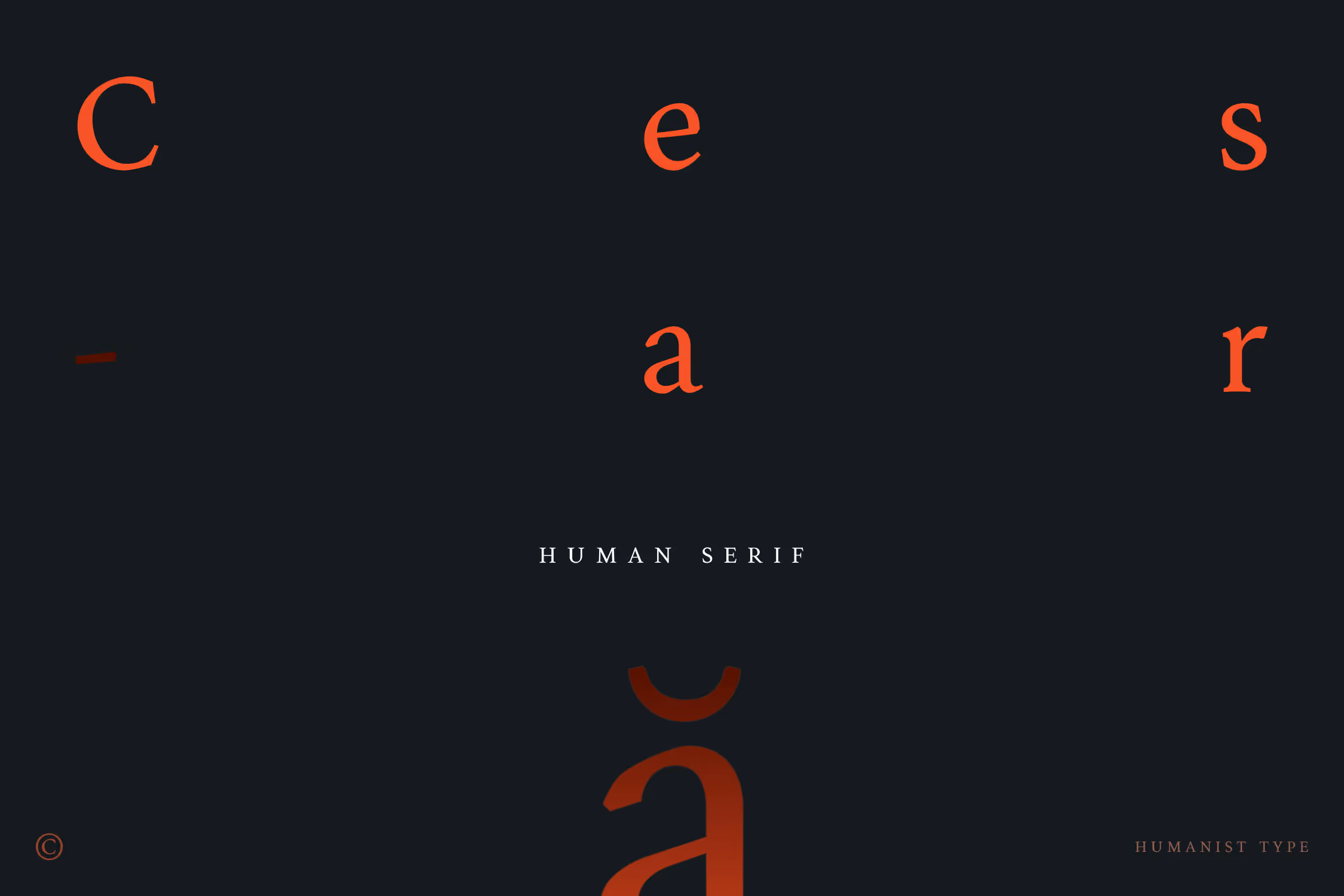
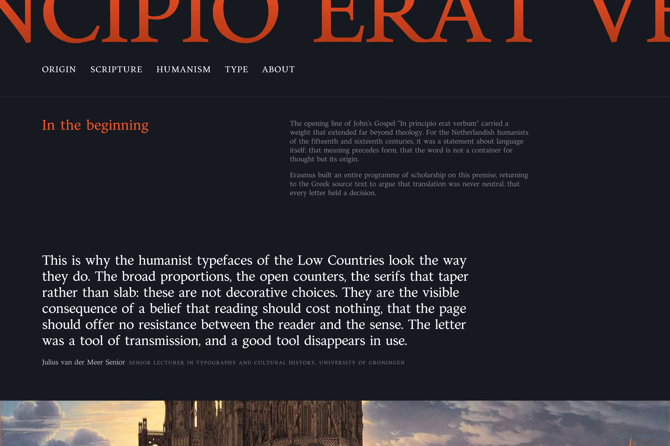
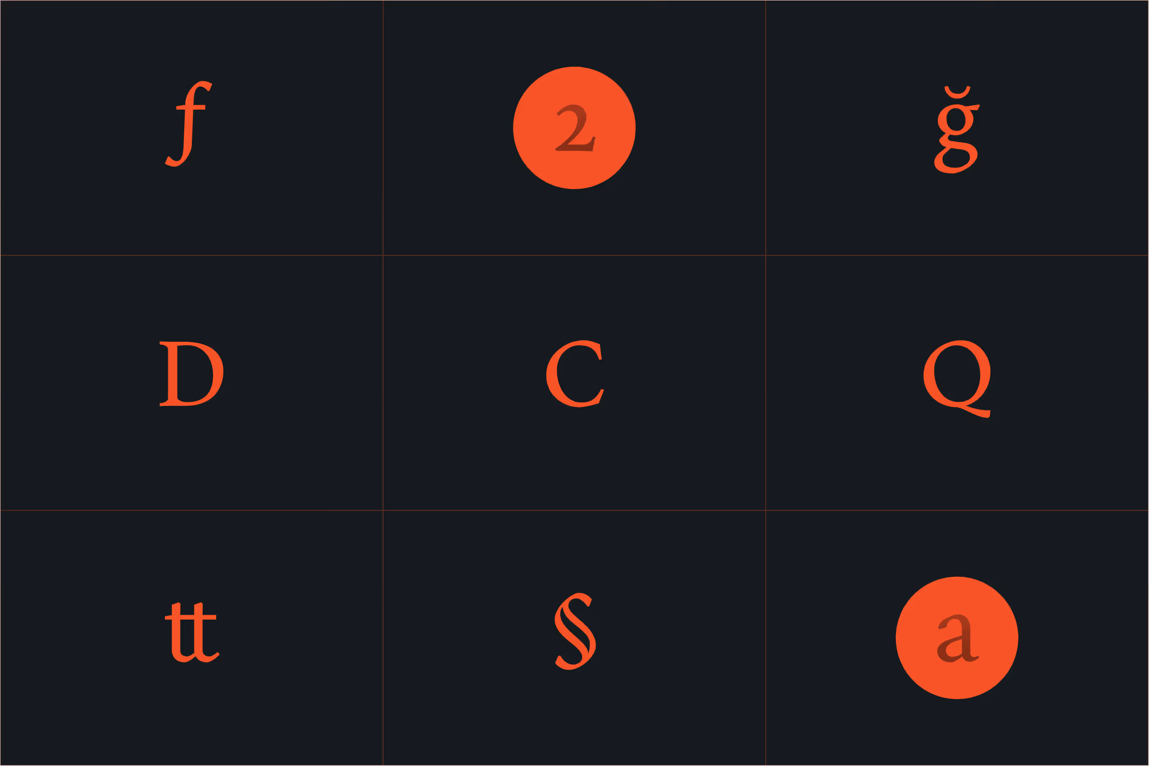
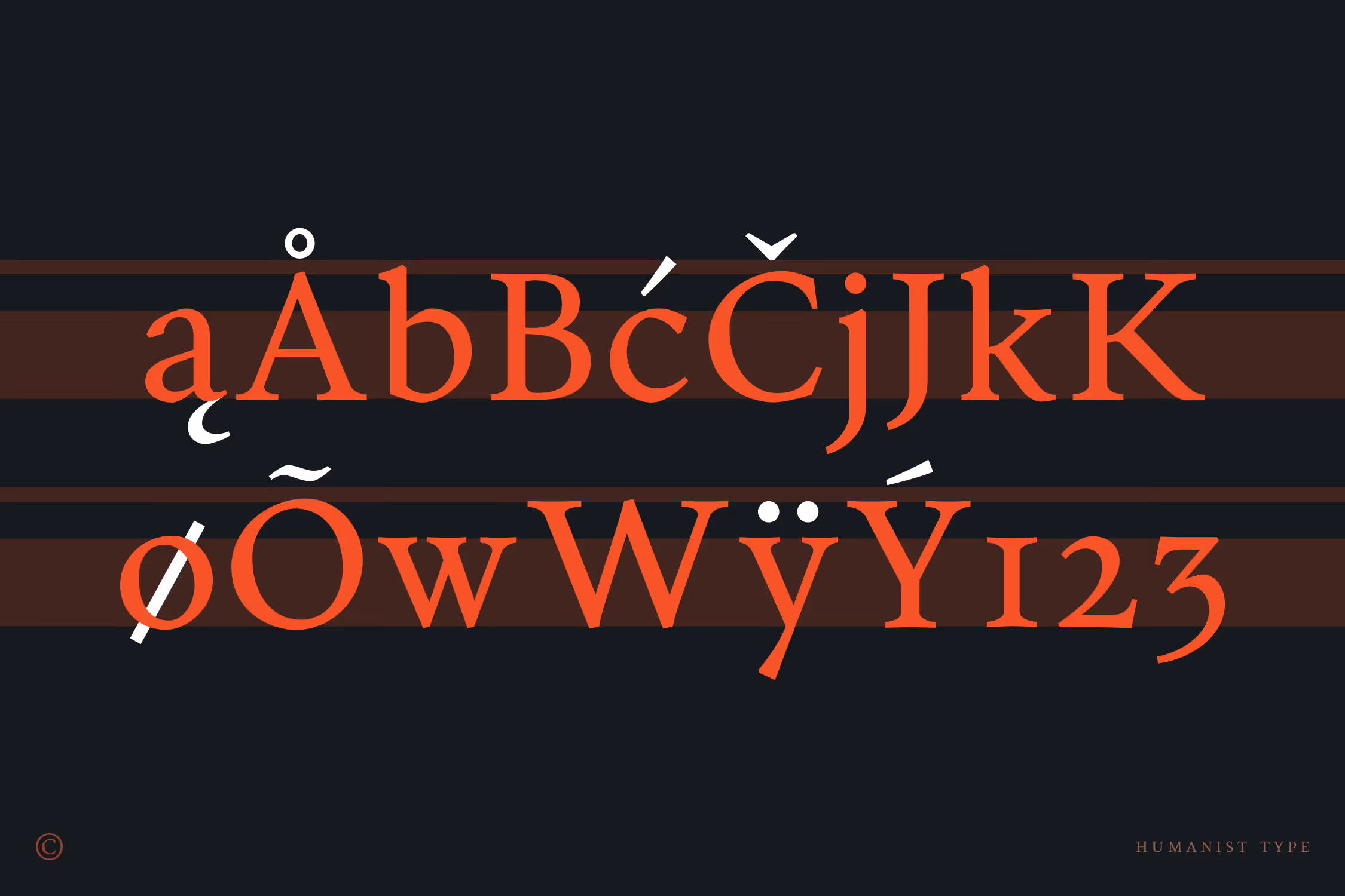
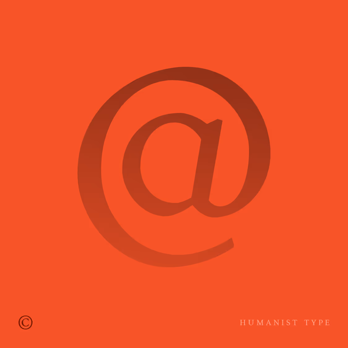
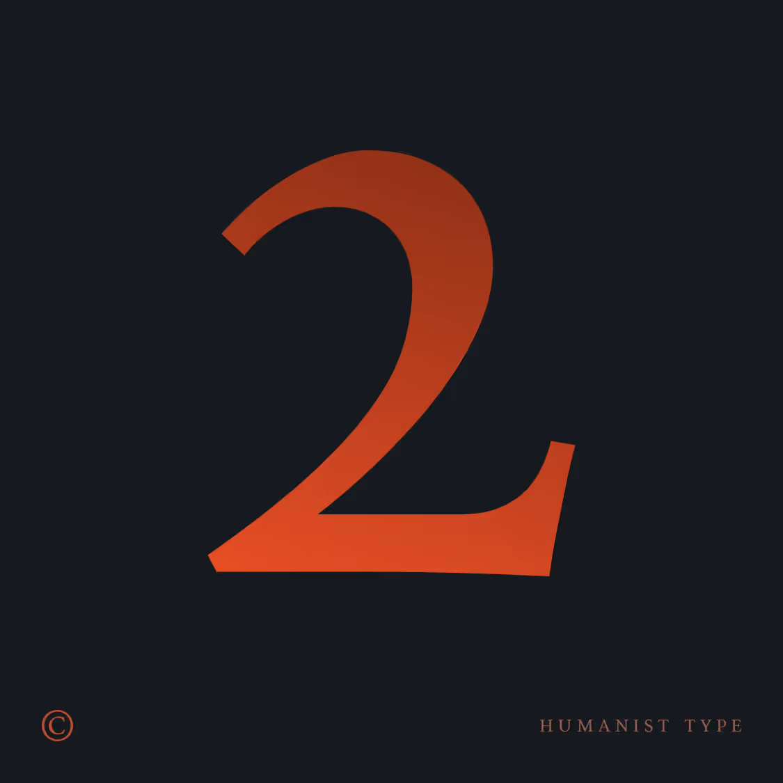
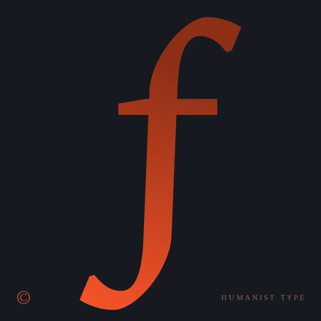
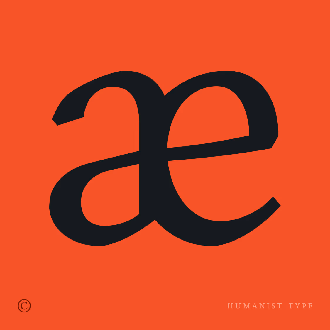
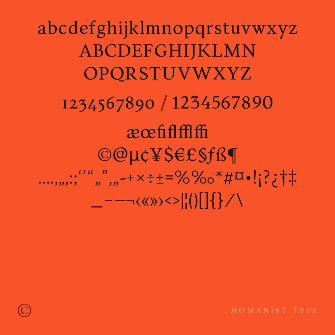
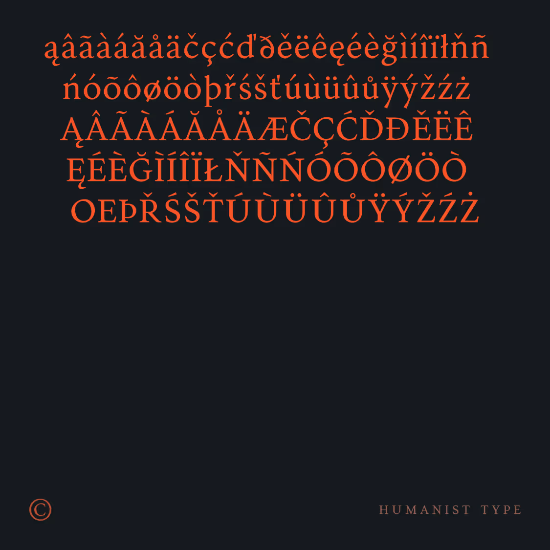
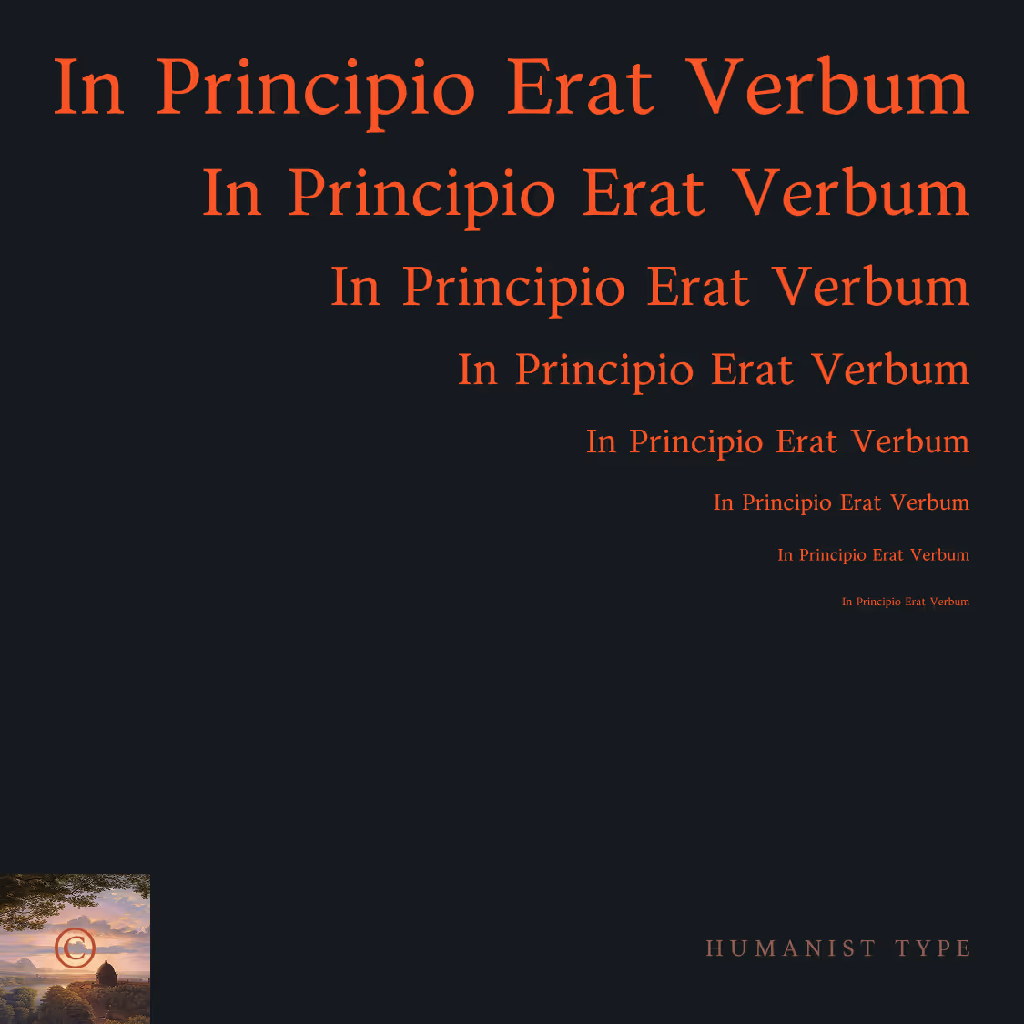
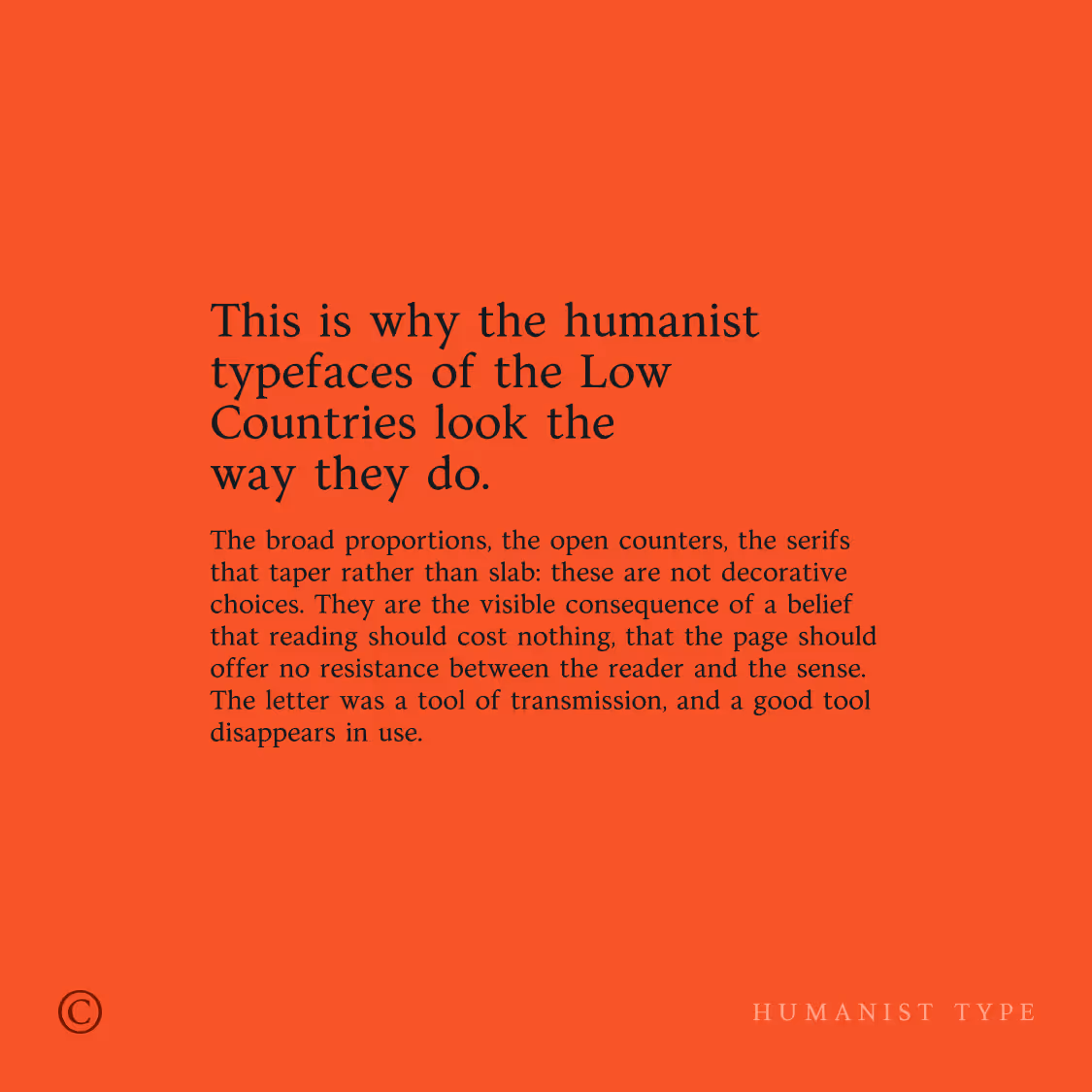
Cesar
A text typeface rooted in Netherlandish humanist tradition, with sharp serifs, wide proportions, and deliberately open spacing. Designed for section-level composition, the forms carry enough presence to hold at display sizes. Old style figures and a full European diacritic set treat it as a working typeface from the start, not a display exercise.
Had to communicate
How it was achieved