Building FUNA across letters, web, and wood
FUNA is a small furniture studio focused on RTV cabinets and a Home Office line still in technical drawings, designed and built in one workshop. The brand grew from the inside out: identity, website, social media, the custom typeface, the furniture itself, and the photography all run through the same workflow.
That setup is not about doing everything alone for the sake of it. It is about what happens when one method runs through five disciplines at once. Decisions cross over: how a cabinet is built informs how a letter is drawn. How a veneer behaves shapes the brand palette. Working on a 3D object after years of working on letterforms changes both.
Project Overview
Outcomes
•
•
•
•
Context
FUNA started as personal furniture work and grew into a small studio. The business needed a system that could carry it past one-off custom projects: a clearer product line, a brand that actually said what the work was about, and a website that could hold its weight in front of architects and clients arriving by recommendation.
The target client was not defined upfront. It emerged over time, shaped by market observation and by ongoing conversations with a befriended architect who has been a steady source of work and a steady source of feedback. Two patterns settled in: people in their thirties finishing an apartment or house, often working with an architect and wary of a decision they will regret in two years, and people in their late thirties to mid-forties with one specific problem to solve, usually a TV wall that has stopped working as a room. Architects sit on top of both as the main referral channel, and the website had to feel like something they would be comfortable forwarding to their own clients.
What the project needed:
•
•
•
•
•
My role
I took the word "multidisciplinary" seriously on this one. Because I was building the furniture by hand, I knew exactly how the letters could be drawn: how much wood DNA could sit inside them, where a curve had to behave like a bent piece of beech, where a join had to feel like a joinery detail. The reverse was true as well: years of working with letters shaped how I read proportions in a cabinet, where the rhythm of a row of doors goes flat, where a top edge needs more weight.
The same loop runs through the whole project. I did not start FUNA thinking about rare veneers. The search for new materials and new processes grew naturally on every front at once: graphic design, letters, web, and furniture. None of these tracks moved on its own.
What I did:
•
•
•
•
•
•
•
•
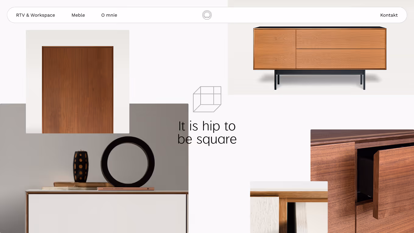
Logo
The logo is a synergy mark that bridges design thinking with nature-led form. The overlapping lines read as a tree cross-section, while also expressing connected craft, organic geometry, and the hands-on making behind each piece.
The construction is intentionally simple: a closed system of overlapping curves that draws from the way growth rings sit inside a trunk, and from the way a classical typeface resolves the relationship between a thick stem and a thin one. It works as a single mark, holds up at small sizes for social and document use, and gives the brand a quiet anchor in a category that usually leans on hand-drawn signatures or wood-burned wordmarks.
Logo
Designed to communicate precision, technology, and professionalism across UI and wayfinding contexts. Subtle chamfers and selective spatial depth preserved the character of icons already recognised by customers for seven years.
Had to communicate
How it was achieved
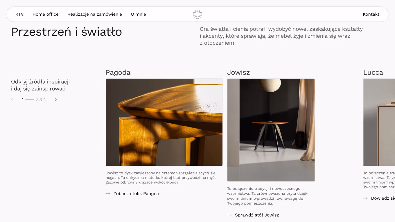
Website
The website is built as a catalogue, not a shop. There is no checkout, no add-to-basket, no instant pricing. Each enquiry runs through direct contact and a short consultation, because that is how the business actually works.
That decision changes the function of every section on the page. The site is not an acquisition tool but a validation tool. Most visitors arrive from a recommendation, usually from an architect or a friend, with most of the decision already made. The job of the homepage is to confirm that the person behind the brand knows what they are doing, and to keep the visit clean and quick.
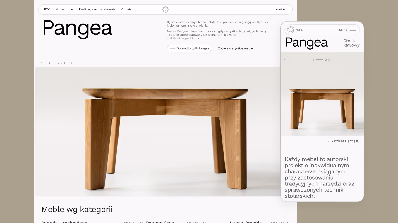
The homepage takes the visitor through:
•
•
•
•
•
•
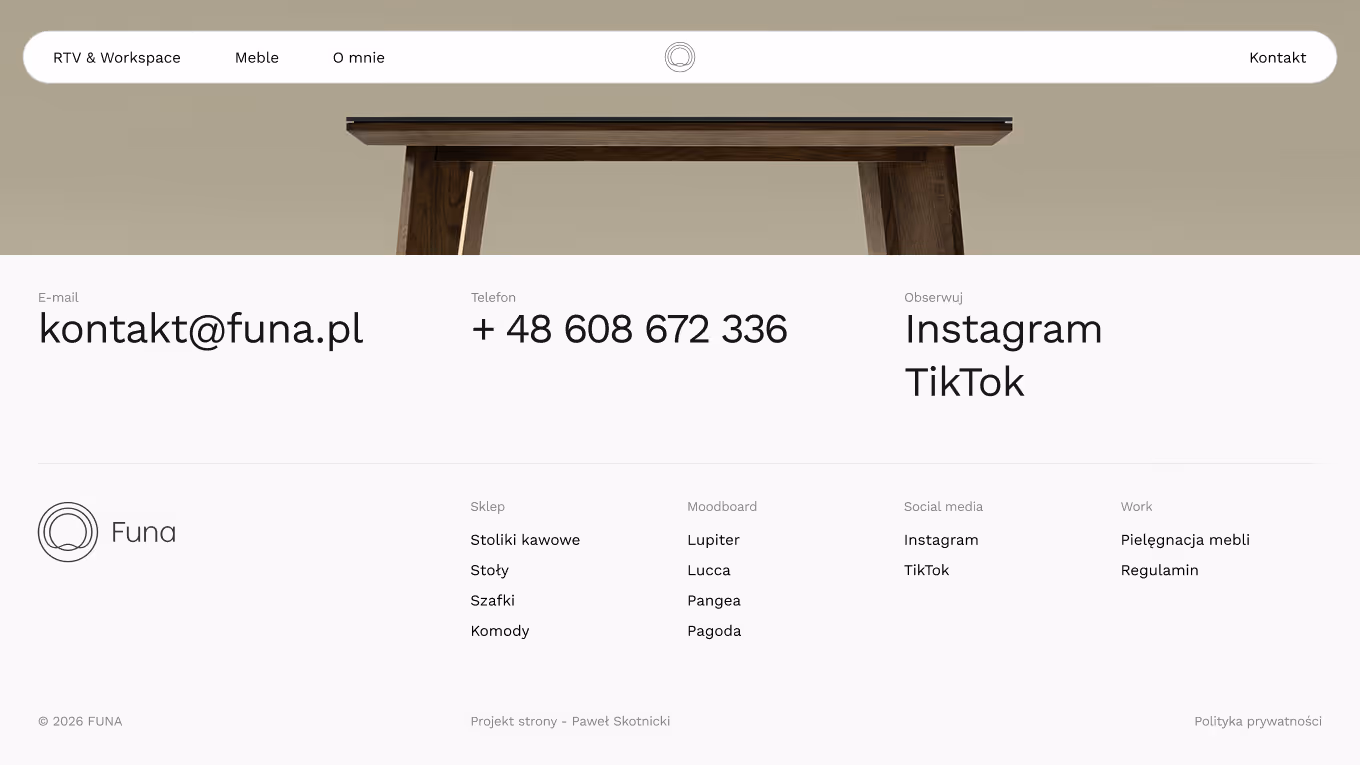
The deeper philosophy lives one click away on the "About the studio" page, not on the homepage itself. A client who arrives from a recommendation does not need a manifesto to make the decision.
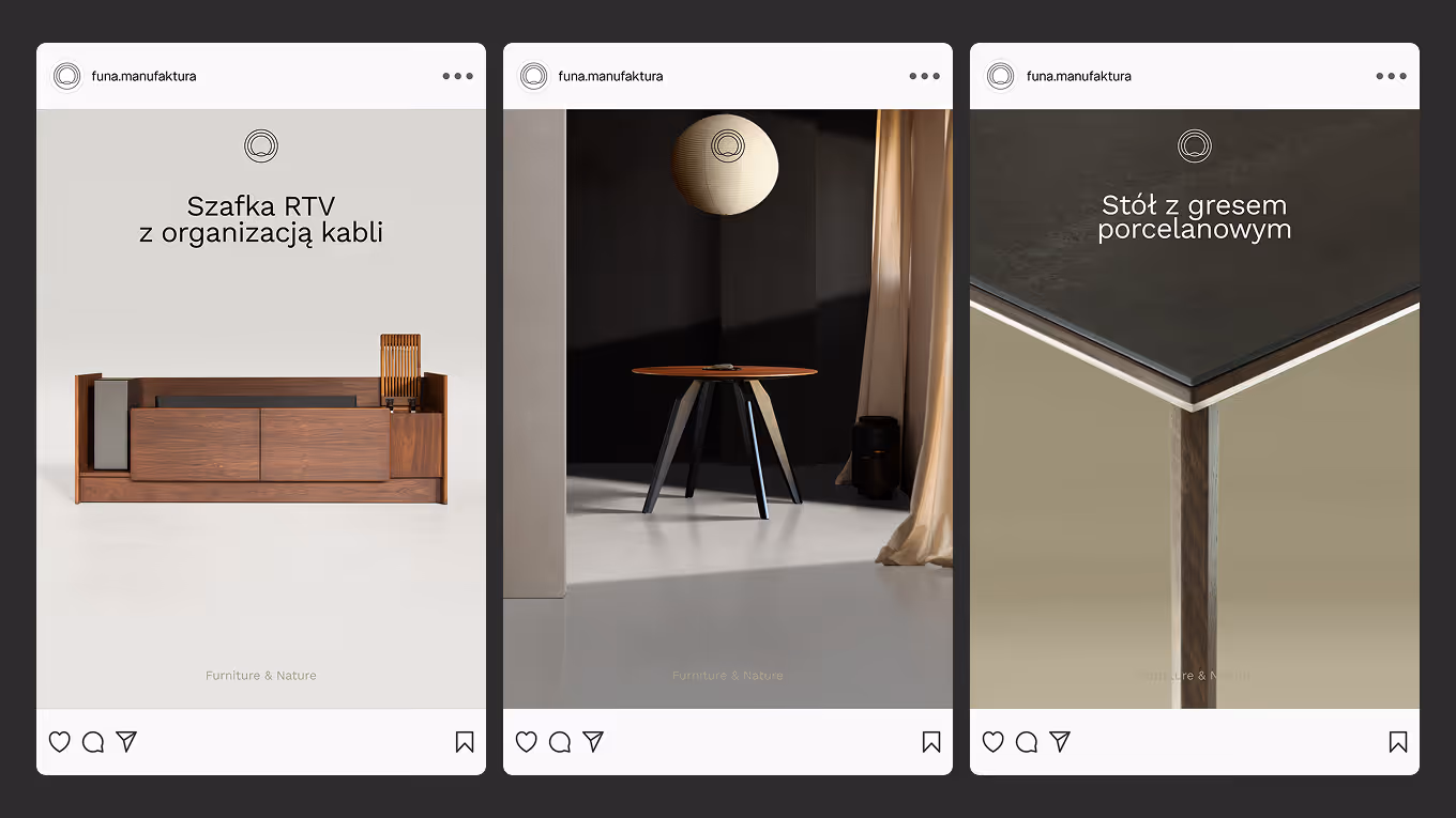
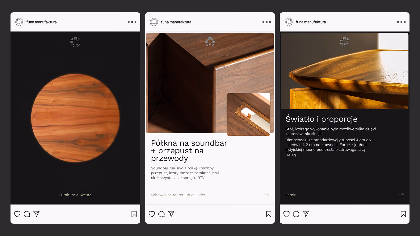
Social media
Instagram is not a sales channel for FUNA today. It is an archive of quality and a slow trust builder, mostly for architects who already know the work. That changes how every post is built.
The content runs on a two-post weekly rhythm: one entry-level post that names a problem (the TV wall as a server room, the router on display, the wrong proportions in a stock cabinet), and one proof post that shows construction, materials, or a finished piece.
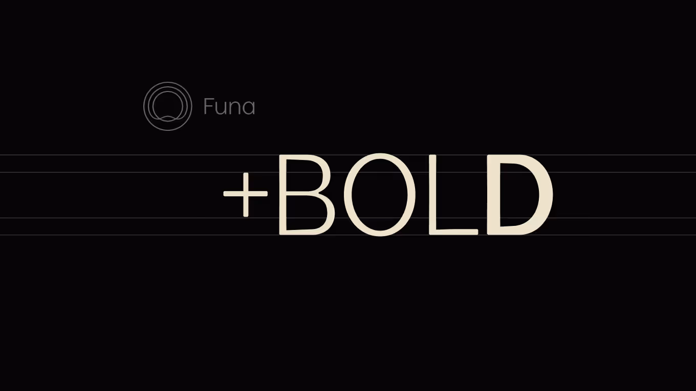
Letters
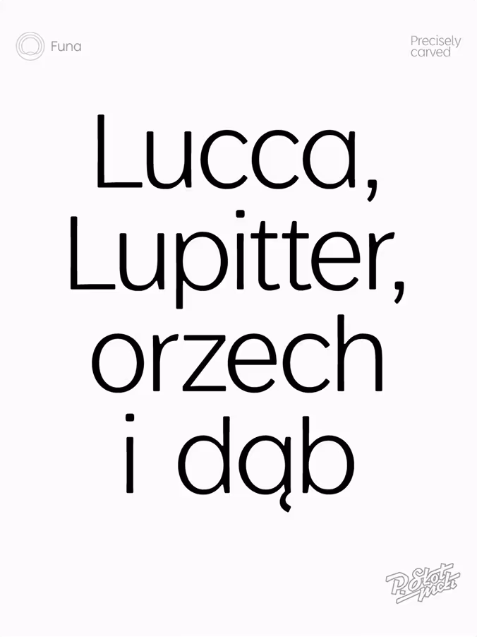
The custom FUNA typeface is the place where the workflow proved itself most clearly. It is still in production, but the direction is set.
The letters are drawn with a craft character. The arches read as if they were bent from beech, in the same logic as a Thonet chair: continuous, evenly distributed, with no abrupt corner where the form changes direction. The stems carry the same proportional discipline used in the workshop, where a vertical edge has to relate to a horizontal one before any joinery is decided.
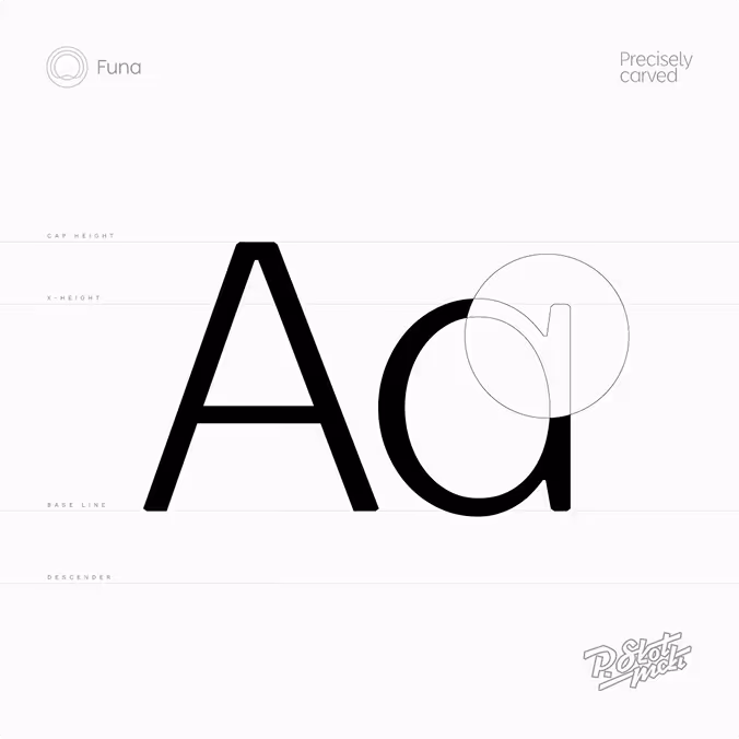
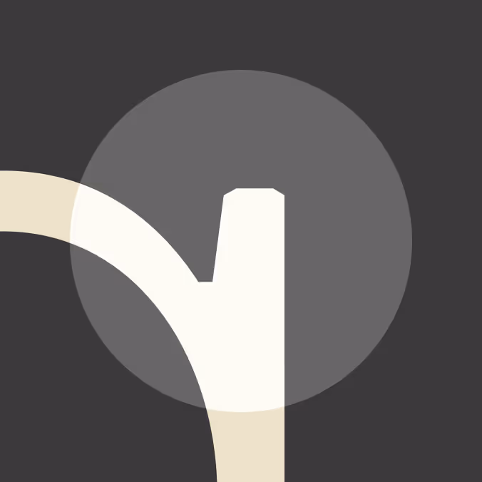
Building furniture by hand changed how I drew the letterforms. I knew where wood resists a tight curve, where it wants to settle into a wider arc, where two surfaces need a small chamfer instead of a hard edge. The typeface absorbed all of that without forcing it into a metaphor.
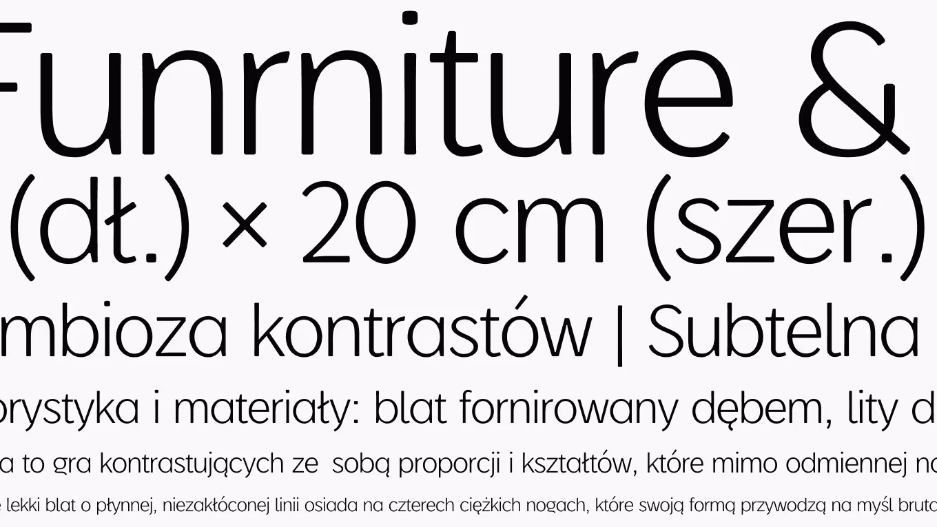
The result is a typeface that does not look hand-drawn, but does look made. It carries enough structure for headlines and product names, and enough character to sit under the FUNA mark without competing with it.
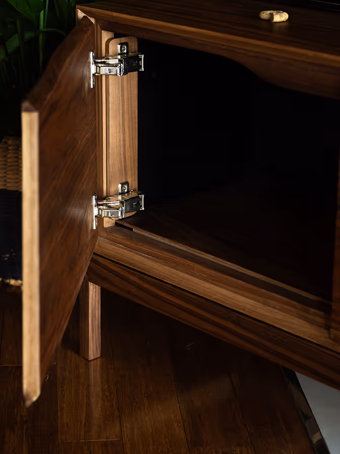
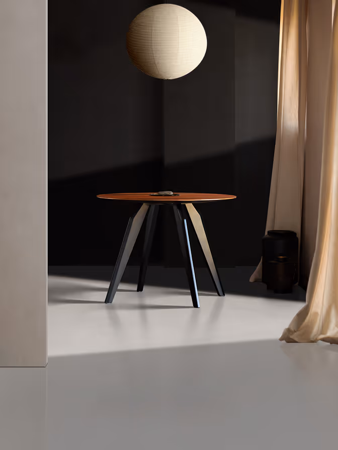
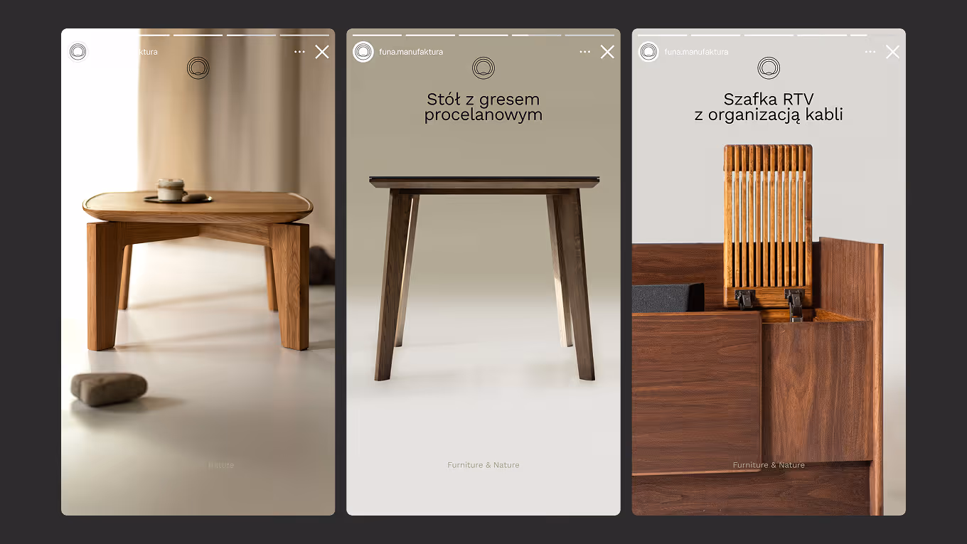
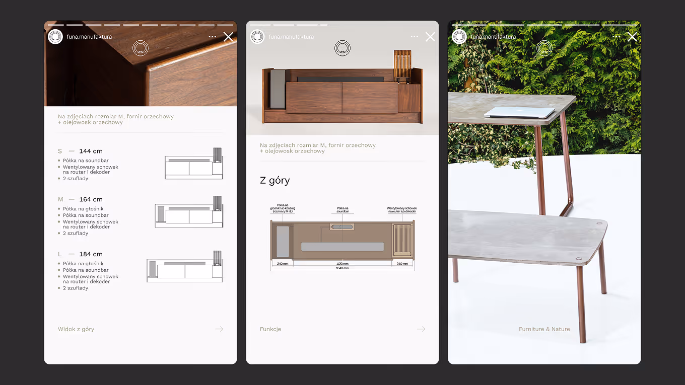
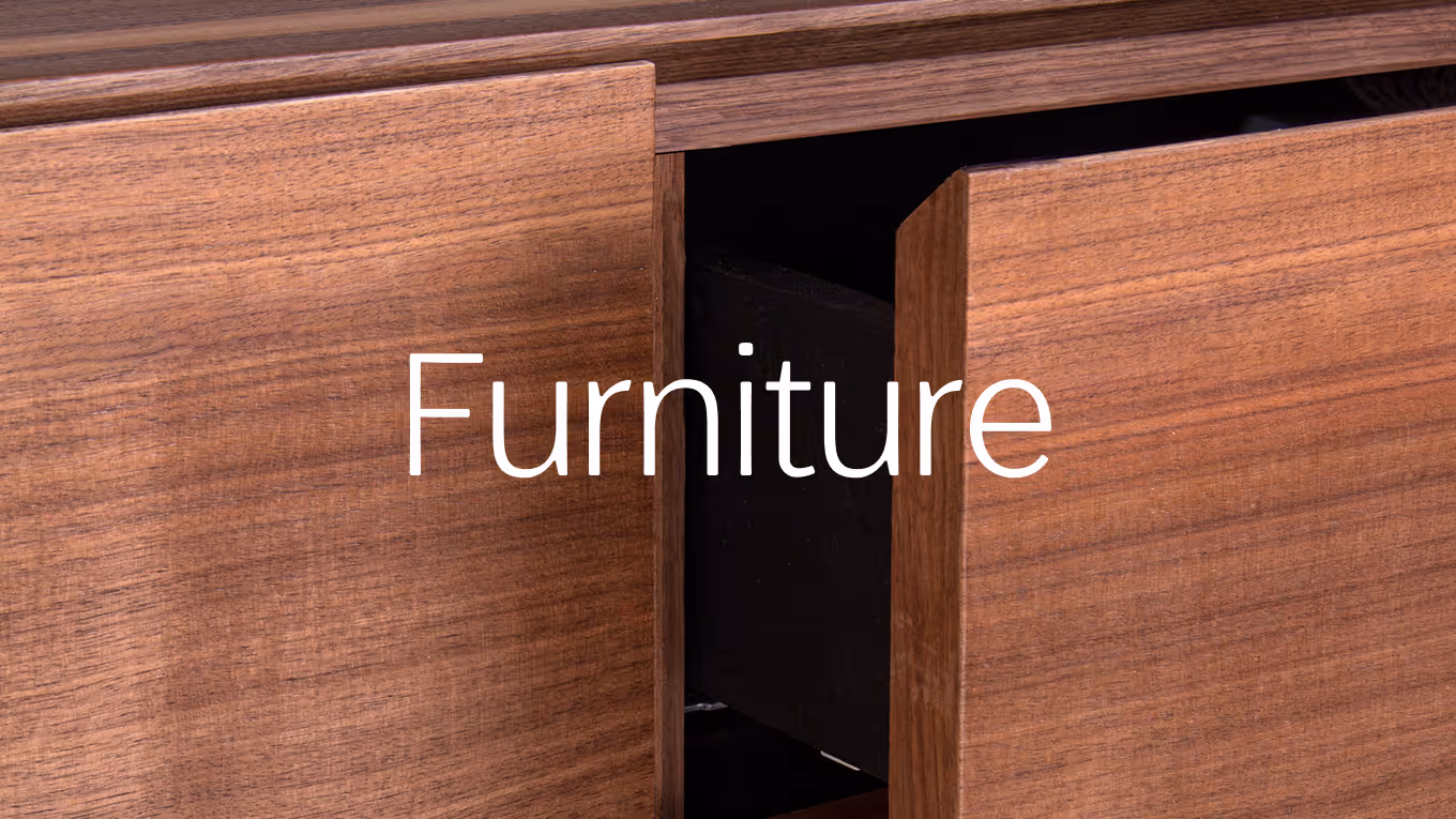
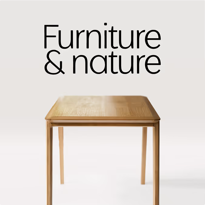
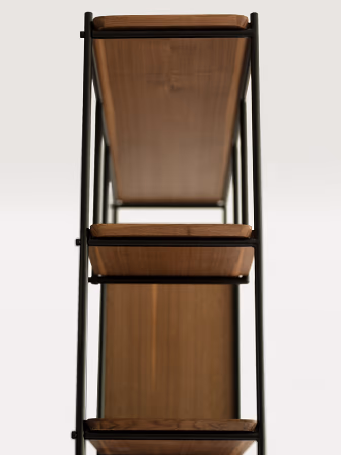
Furniture
The furniture is where everything from graphic design lands in three dimensions. Years of working with letters shaped how I read a cabinet: where a row of doors needs a wider gap, where a top edge wants more weight, where a base needs to disappear so the body above it can do its work.


Graphic design, letters, web, and furniture evolved together, none of them sitting still while the others moved. That is what real synergy looks like in practice.