Building a clearer online catalogue for a local automotive store
Auto-Części needed a website that works like a practical online catalogue, not an e-commerce store. The goal was to help local customers find the right category fast, understand how ordering works, and move naturally toward a phone call, reservation, or in-store pickup. The project combined a Webflow website, a clear SEO-led structure, a custom logo system, and a large library of custom pictograms and original photography.
Project Overview
Outcomes
•
•
•
•
•
Context
Auto-Części Paczków serves a very broad audience, from younger drivers and everyday buyers to mechanics and owners of older vehicles. That meant the website had to feel simple enough for someone browsing casually, while still being useful for people who already know exactly what part they need.
The challenge was not to recreate a full online store. It was to build a digital layer that supports how the business already works offline: local visibility, fast product lookup, direct contact, and pickup in store.
What the project needed:
•
•
•
•
My role
I shaped the information architecture, designed and built the website in Webflow, and developed the wider visual direction around logo, icons, and photography. I also translated the business model into a practical catalogue-first flow, where the site helps users identify the right area quickly and then directs them toward calling, reserving, or visiting the store.
What I did:
•
•
•
•
•
•
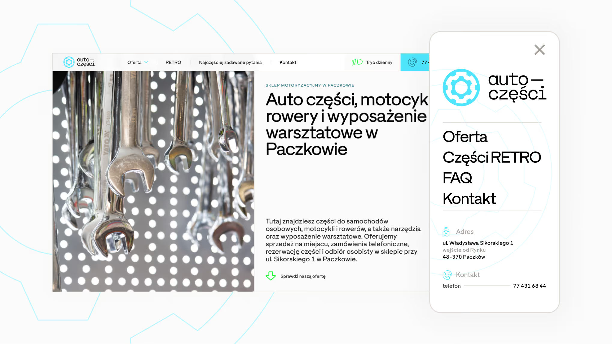
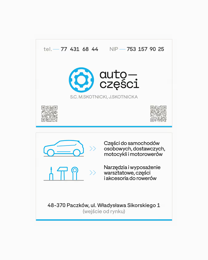
Logo
The logo was designed to feel direct, technical, and practical without becoming cold or overdesigned. The core mark combines a gear symbol with mono-spaced lettering based on a modified Space Grotesk Mono, which gives the identity a strong retail character and a clear connection to the category.
The system also opens up into two useful extensions:
•
•
The RETRO direction leans more into vintage automotive lettering, especially the kind associated with older performance cars. That gives the older stock its own recognisable layer, without forcing the whole brand into a nostalgic position.
Website
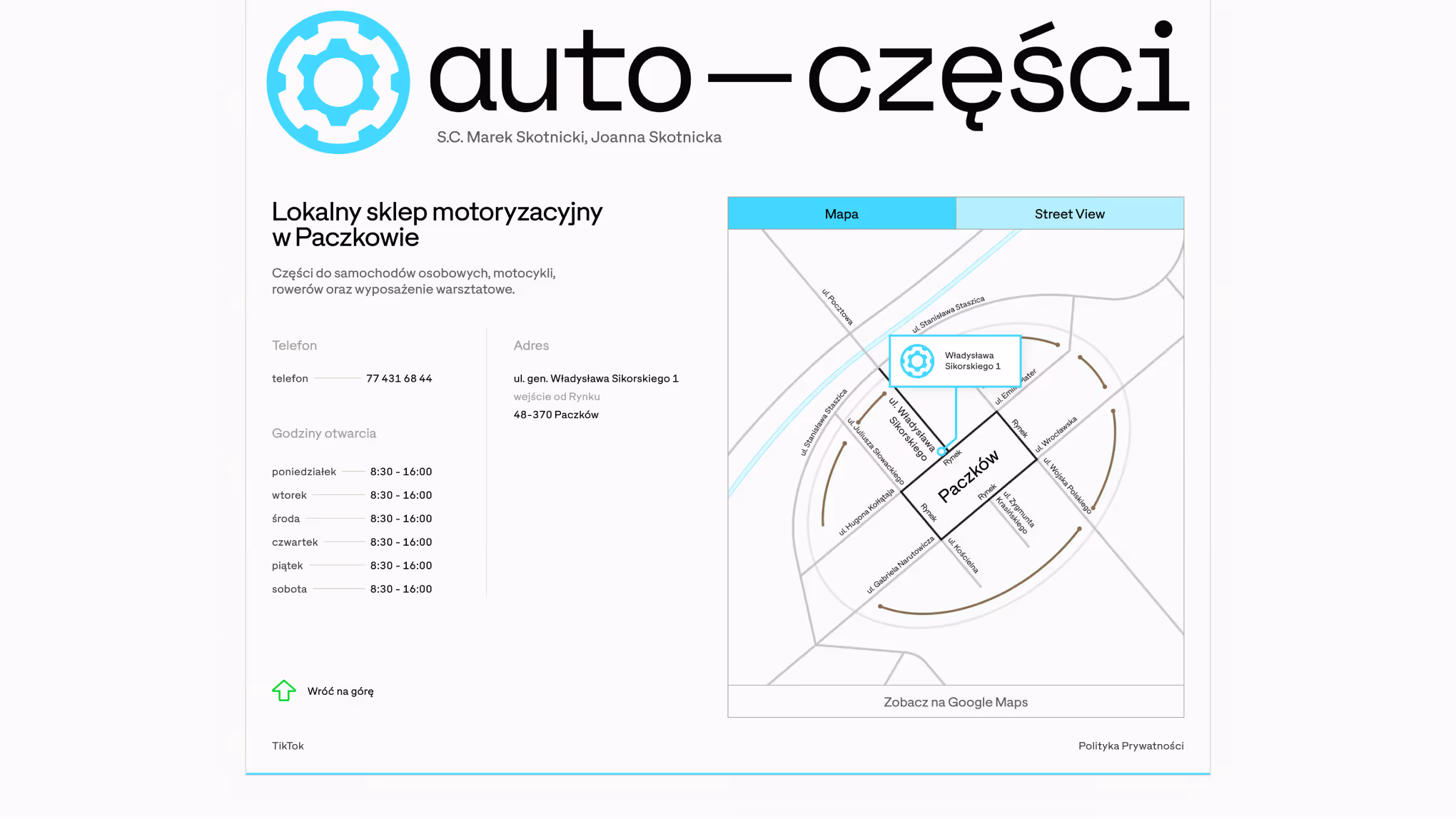
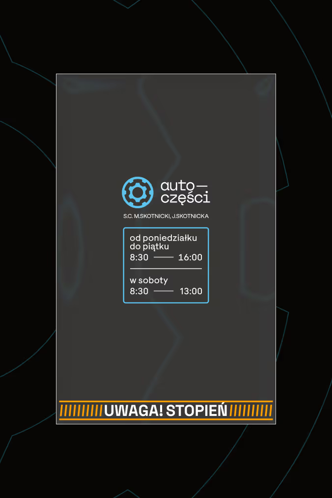
The website was designed as an online catalogue, not a shopping cart. On the current live build, the homepage already explains the core model clearly: parts can be ordered on site or by phone, selected items can be reserved for later pickup, the catalogue is updated every Monday, and older stock is routed into a dedicated RETRO section. The same page also builds local trust through reviews, opening hours, address details, and map access.
The structure is built around five practical entry points:
•
•
•
•
•
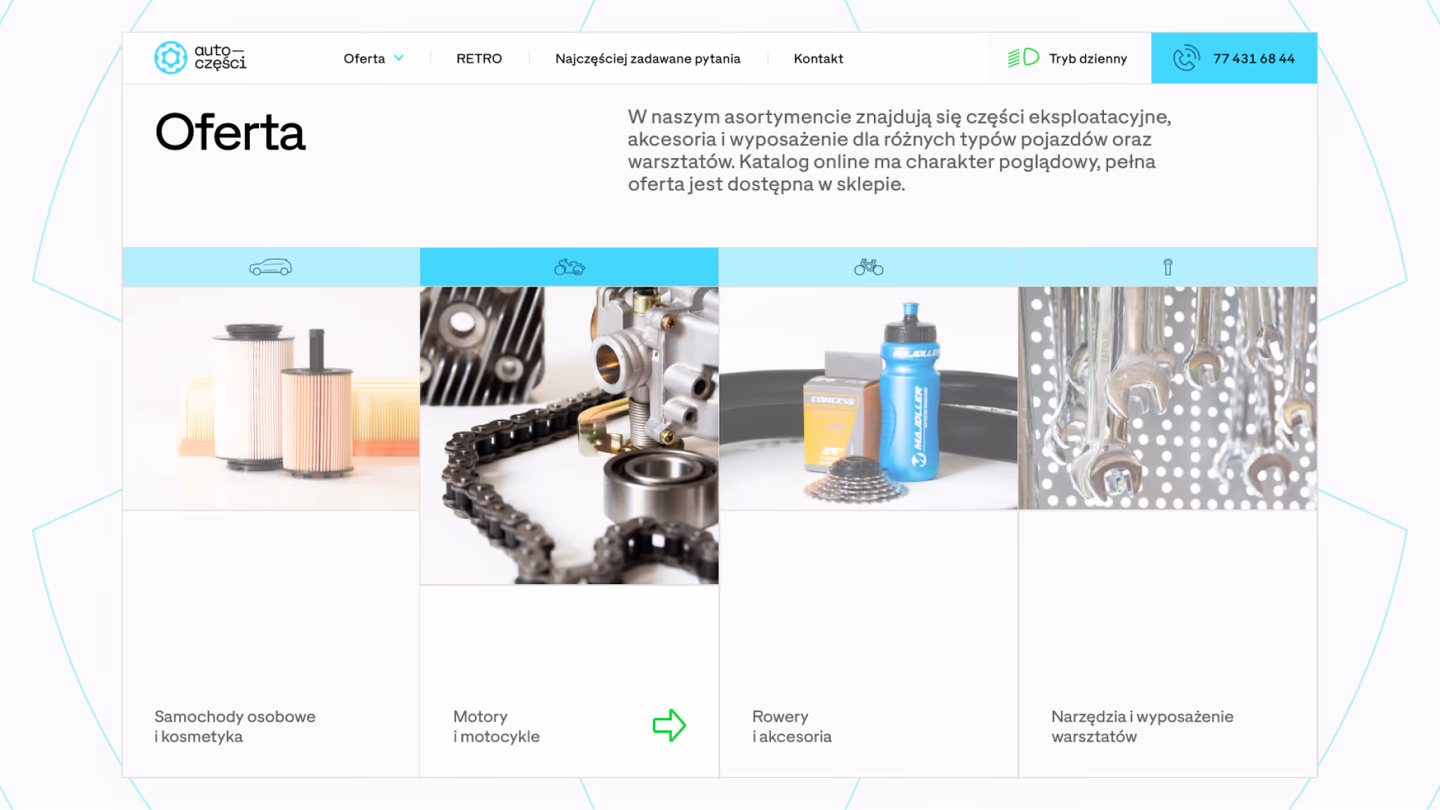
Each category page was planned as an SEO landing page with a narrower focus, using grouped product types, selected producers, and a simpler visual system that relies more on pictograms than heavy imagery. The current live build already exposes the homepage category hub and a dedicated car-parts page, although that page’s lead should be tightened before launch because it currently describes the whole store offer rather than the car category alone.
Visually, the interface takes cues from brutalist web design: 1px lines, frames, and sharp divisions that echo the feel of older automotive manuals. That language felt especially relevant here, because it gives the project a distinctive logic without turning the whole website into a vintage gimmick. The category section was also inspired by the cross-section of a four-cylinder engine, which shaped the layout rhythm and the idea for motion in that part of the homepage.
Visual Identity
The visual identity was built to support a wide product range and a wide customer base without losing character. Instead of leaning on generic automotive aesthetics, the system uses strong framing, technical typography, and restrained graphic decisions that feel closer to manuals, packaging, and workshop materials than to typical online retail.
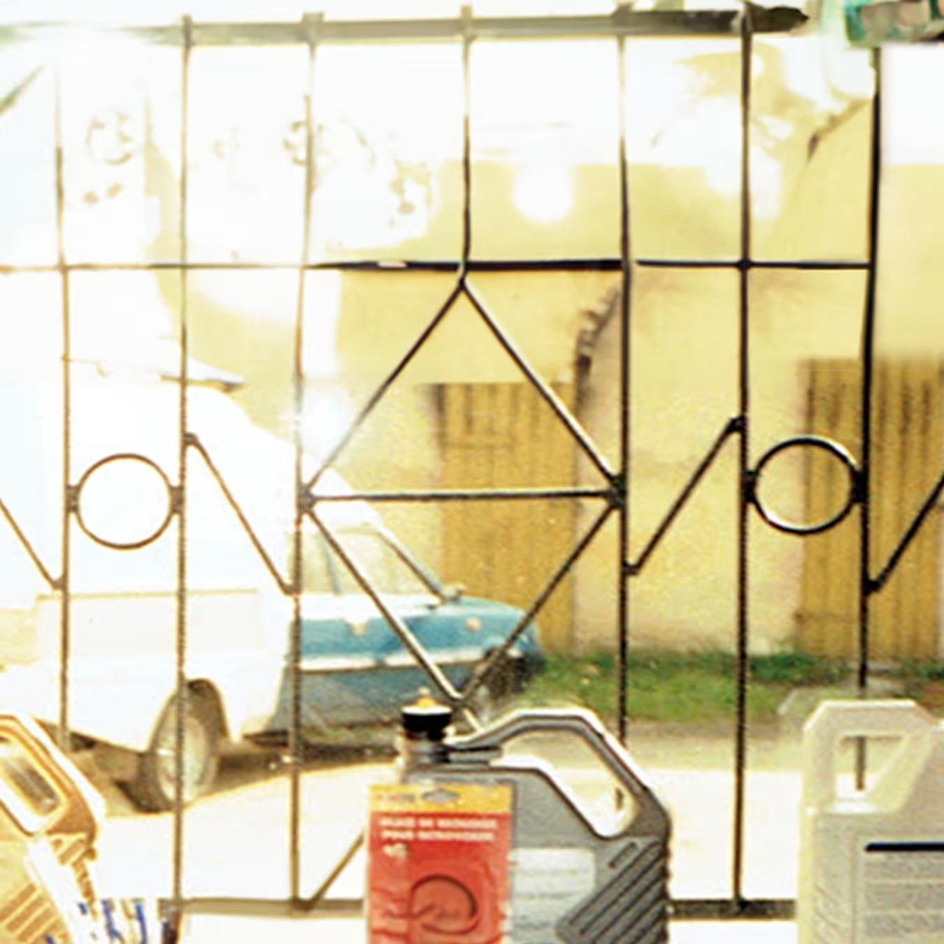
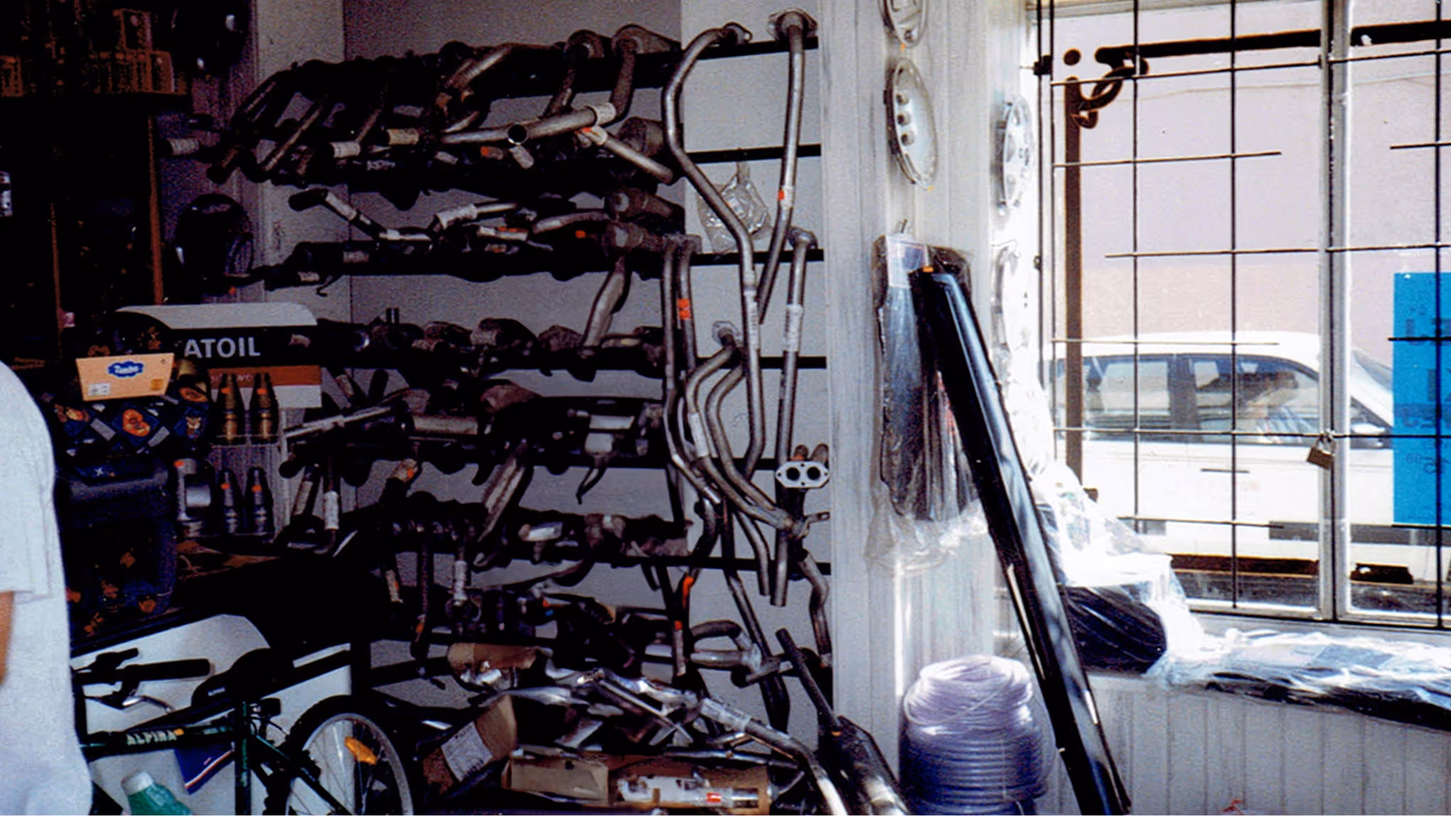
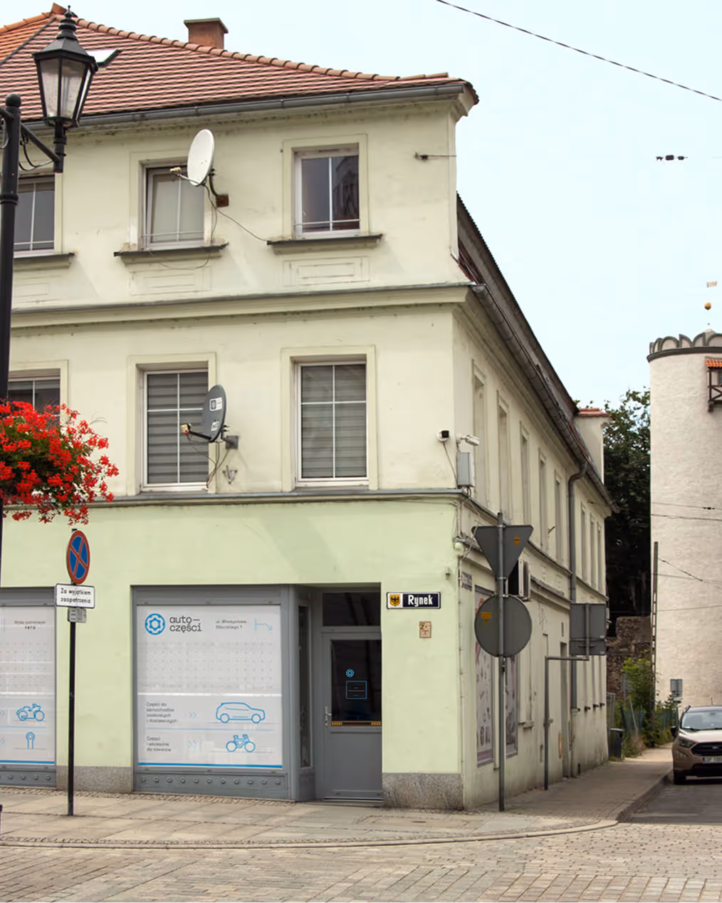
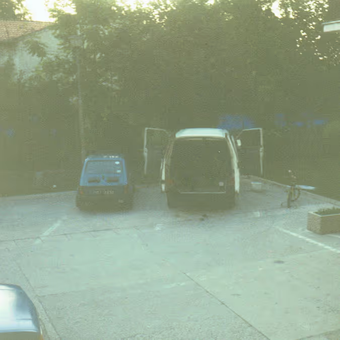
A key part of the project is the image library. There are no stock assets here. The website and case study are supported by a full custom photo shoot of real products, plus archive photographs of the store from the early 1990s. That gives the brand a stronger sense of reality and continuity, while keeping the project grounded in the actual business rather than a borrowed visual mood.
The result is a system that can speak to different kinds of users at once: everyday drivers, mechanics, and customers looking for less obvious older parts.
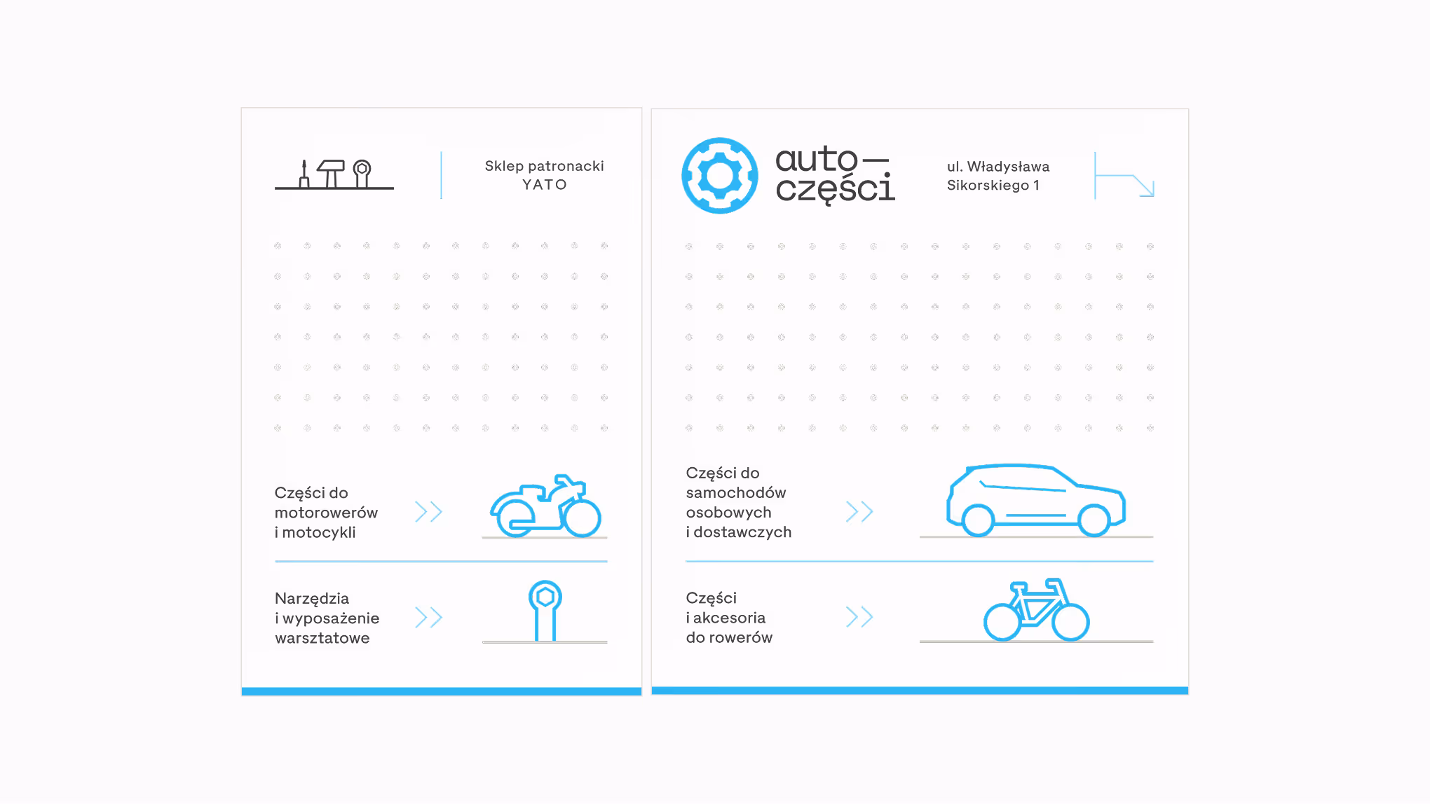


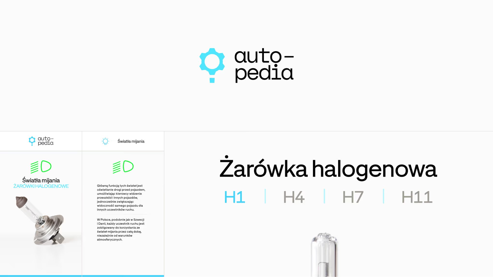
Pictograms
This project also brought forward my first broader custom pictogram family. The earliest sketches date back to 2017, but the system still holds up because the forms stay simple, readable, and compact. Their character sits close to the logic of LCT-Ciburial, which makes them work naturally with the type-led direction of the brand.


On the website, the icons are not just decorative. They help reduce image dependency, improve scanability, and communicate product groups faster, especially on SEO-oriented landing pages where users need quick orientation more than visual noise.

This also makes the interface lighter. Instead of relying on many product photos inside every informational box, the pictograms do the categorising work more efficiently and keep page loading cleaner.