
Turning a Technical Offer into a Clear System
VENTOR delivers sheet-metal machinery tailored to each client’s production needs. Their offer covers lasers, presses, and internal transport systems for moving loads through warehouses and production floors. The team supports projects from the first technical consultation through implementation, and stays involved after launch with service and long-term partner support.
Even though this is a highly technical industry, Ventor’s advantage is built on people. The quality of advice, the way they work with clients, and the responsibility they take for outcomes are what make the business work.
Project Overview
Outcomes
•
•
•
•
Context
I first worked with VENTOR in 2018, creating the original logo, a pictogram system, and smaller print assets. Years later, the company reached out again to align how the brand looks and communicates across channels. When the existing website was reviewed, it became clear that the biggest gap was structure. The offer had grown without a consistent system, and content quality varied across pages.
What we found:
•
•
•
The work moved from a visual refresh to building a foundation that could scale and stay easy to maintain.
My role
I prepared early stage draft copy with AI to map the content structure and set a direction for tone of voice before design production started. I also documented the strategy work and key decisions as the project evolved, so the team could stay aligned.
What I did:
•
•
•
•
•
•
•
•
The result was a consistent set of tools that works across web, sales materials, and day to day communication.
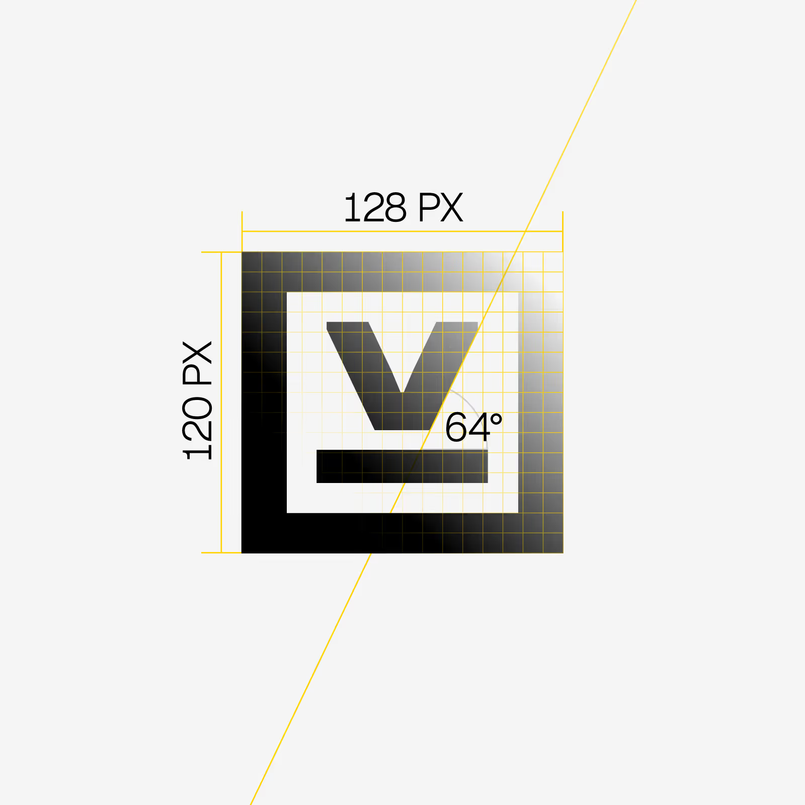
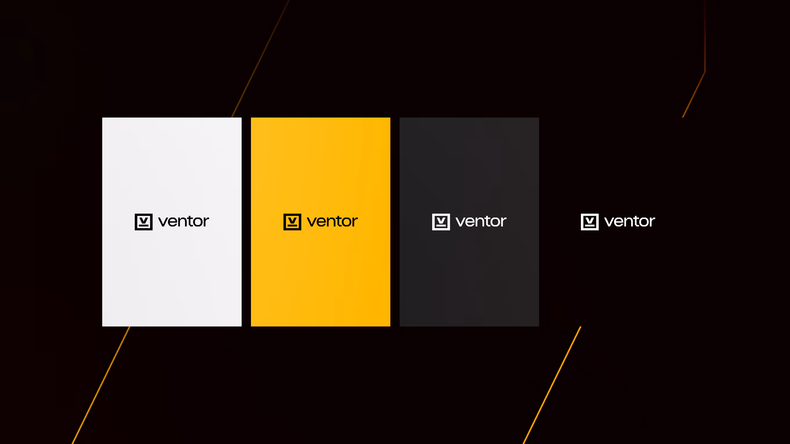
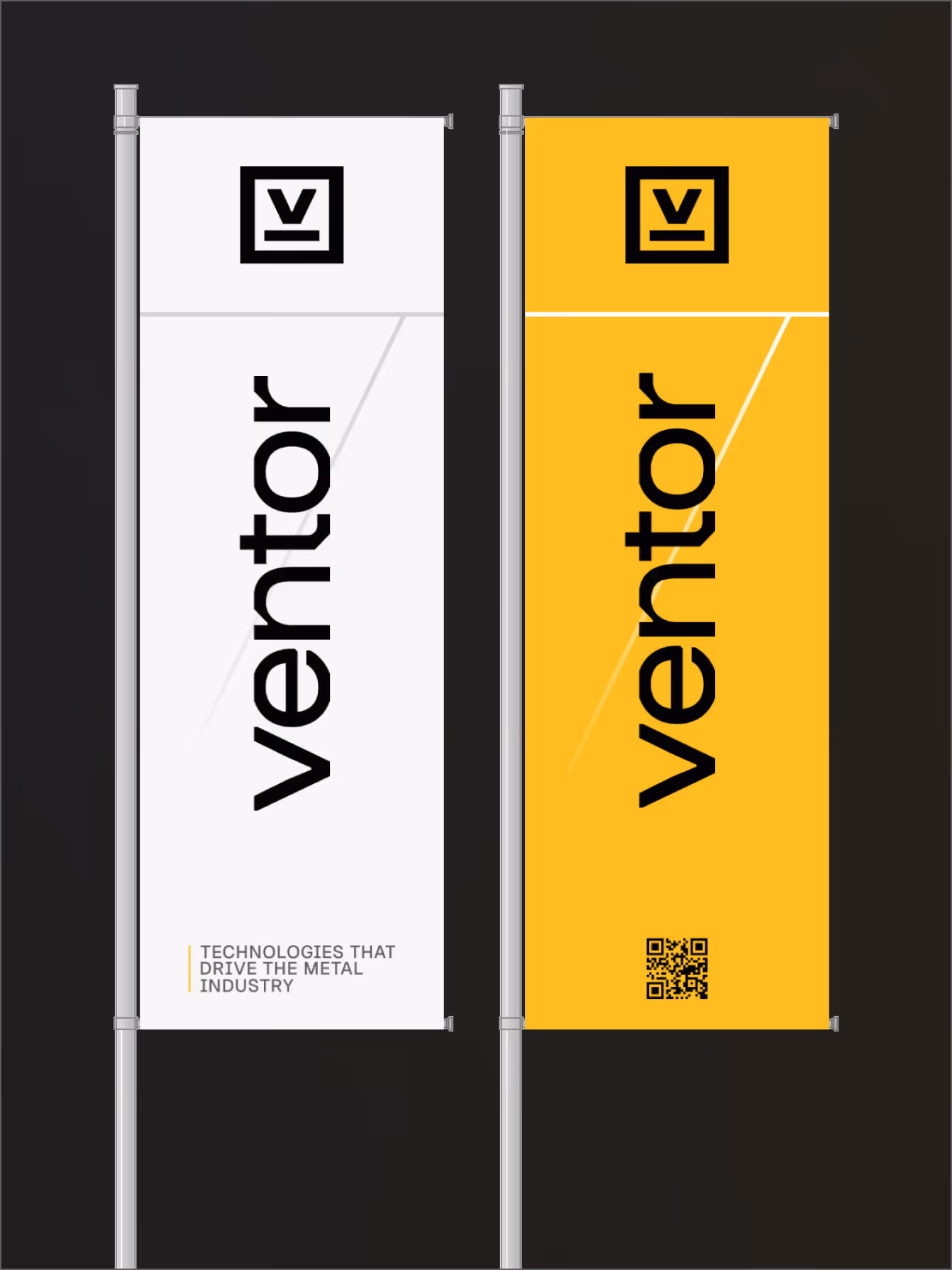
Logo
VENTOR needed a mark that feels precise and reliable without looking distant, and it had to stay clear on machine plates, documents, vehicles, and small digital placements. The final symbol is a grid based V mark (128×120) built to stay crisp at any size.
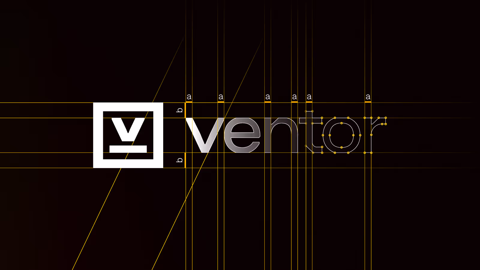
The V sits inside a softened rectangle that keeps the geometry clean and controlled, while adding a more approachable edge that fits a technical brand built on close client work. The result is a strong anchor that holds the identity together across web, social, print, and on site applications.
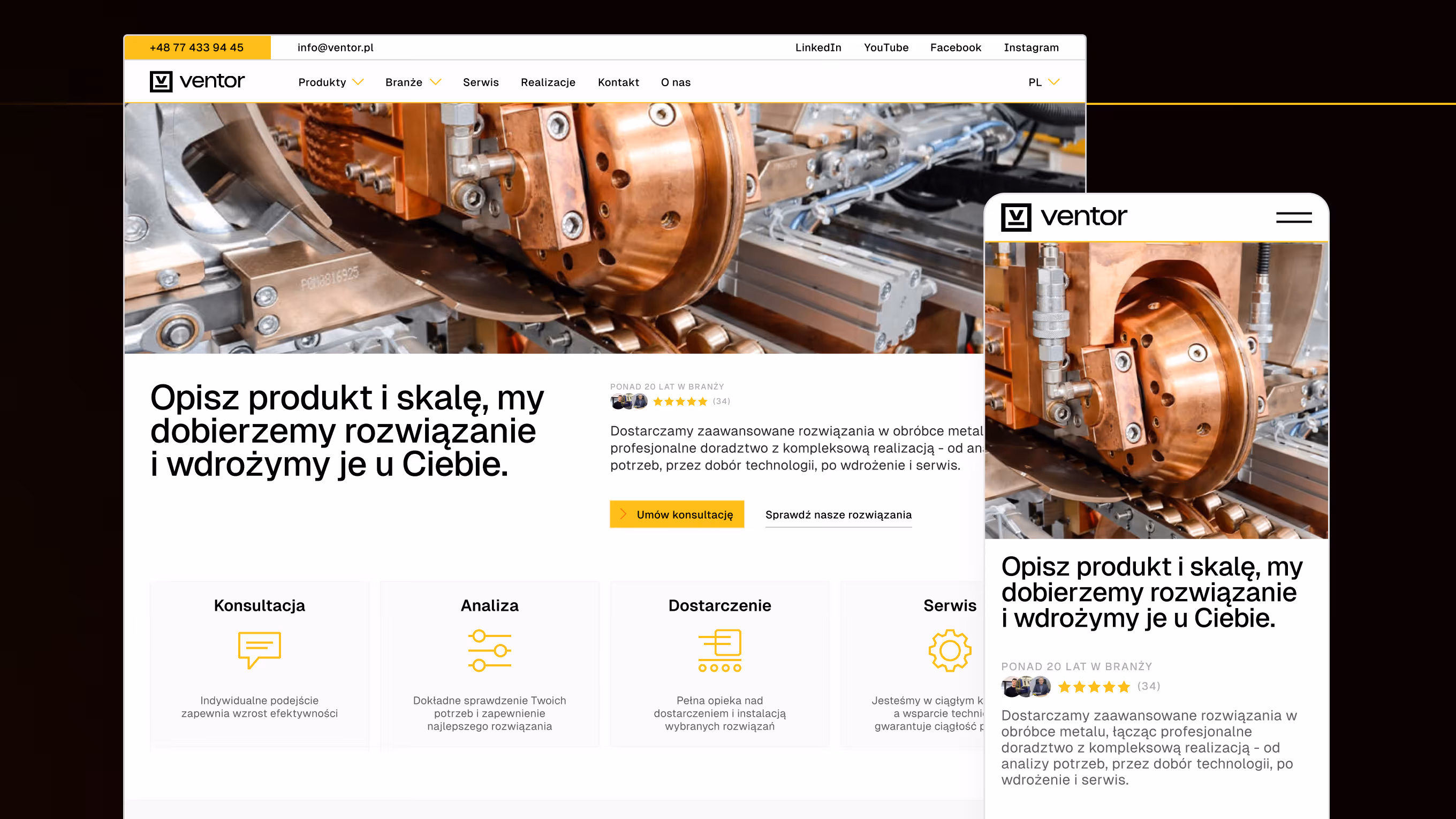
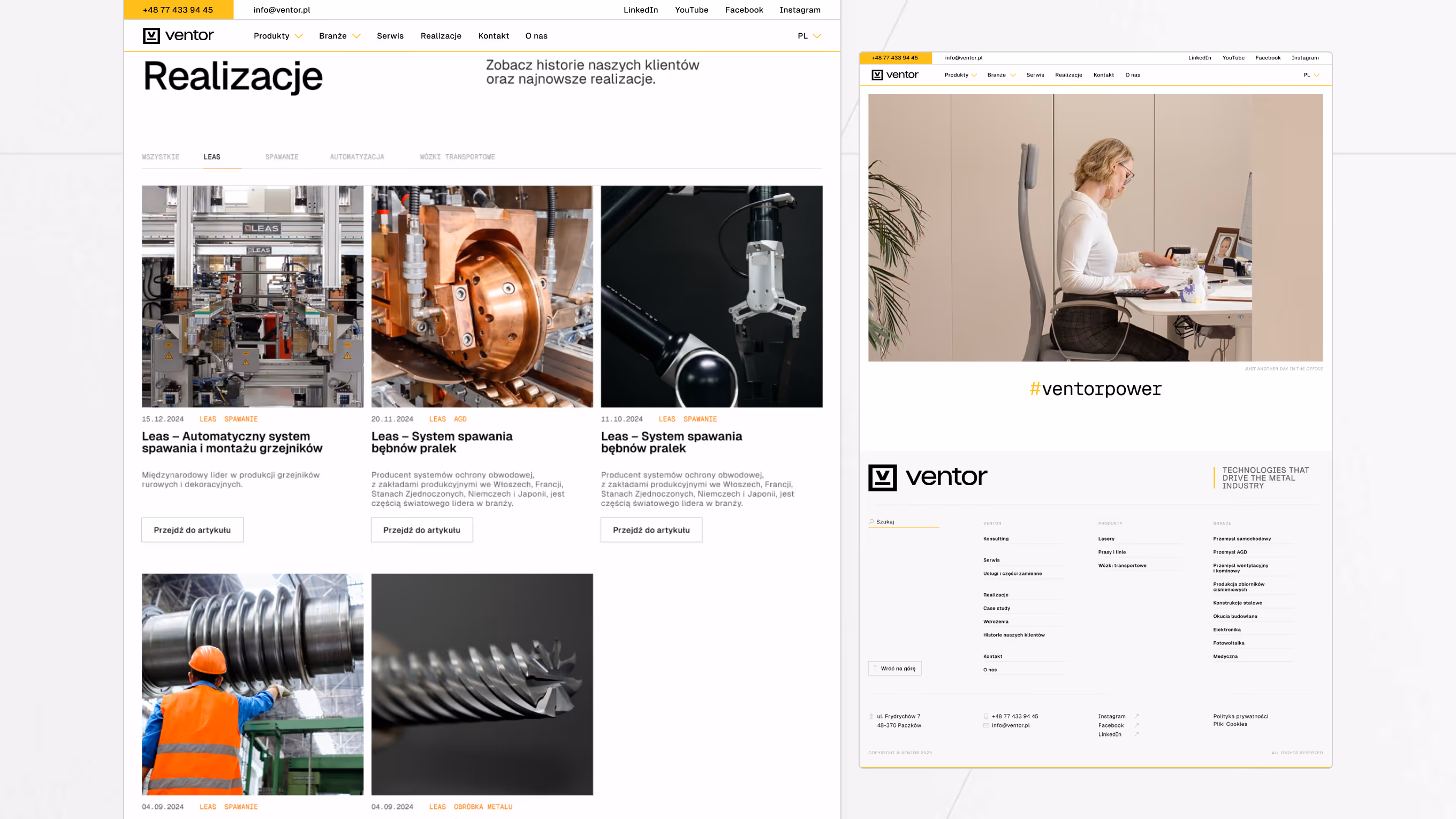
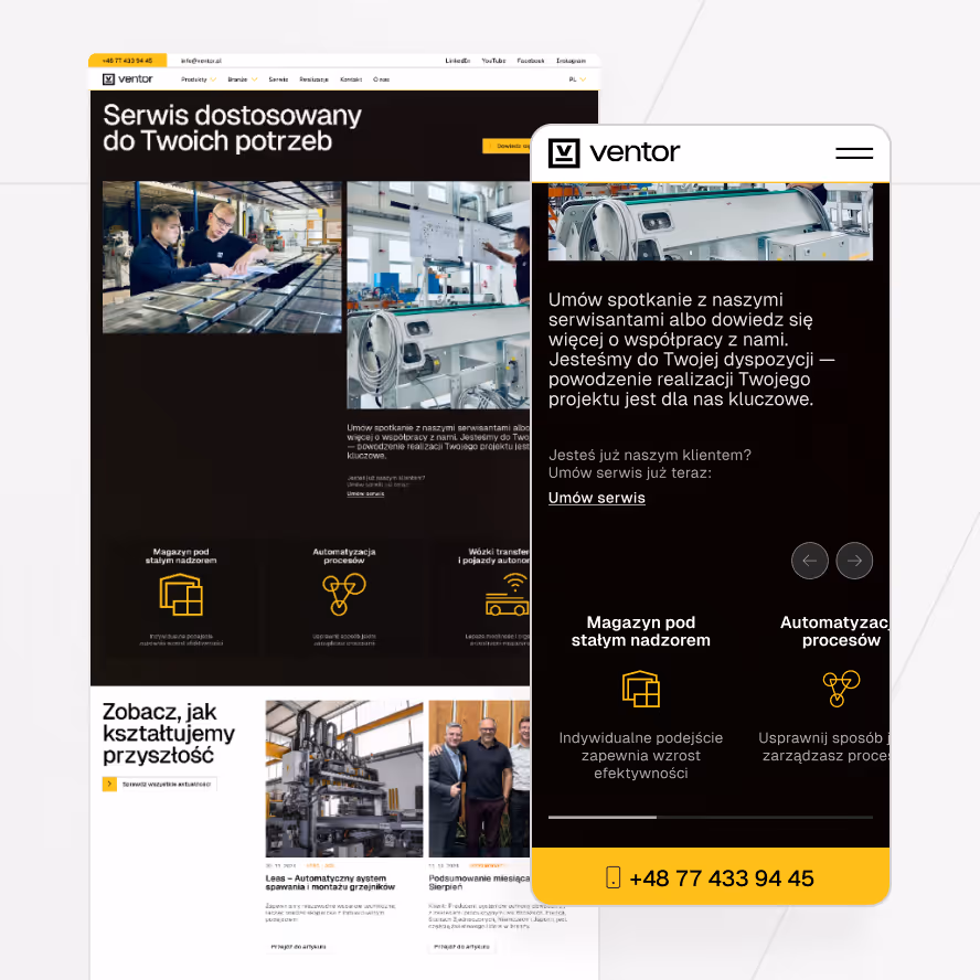
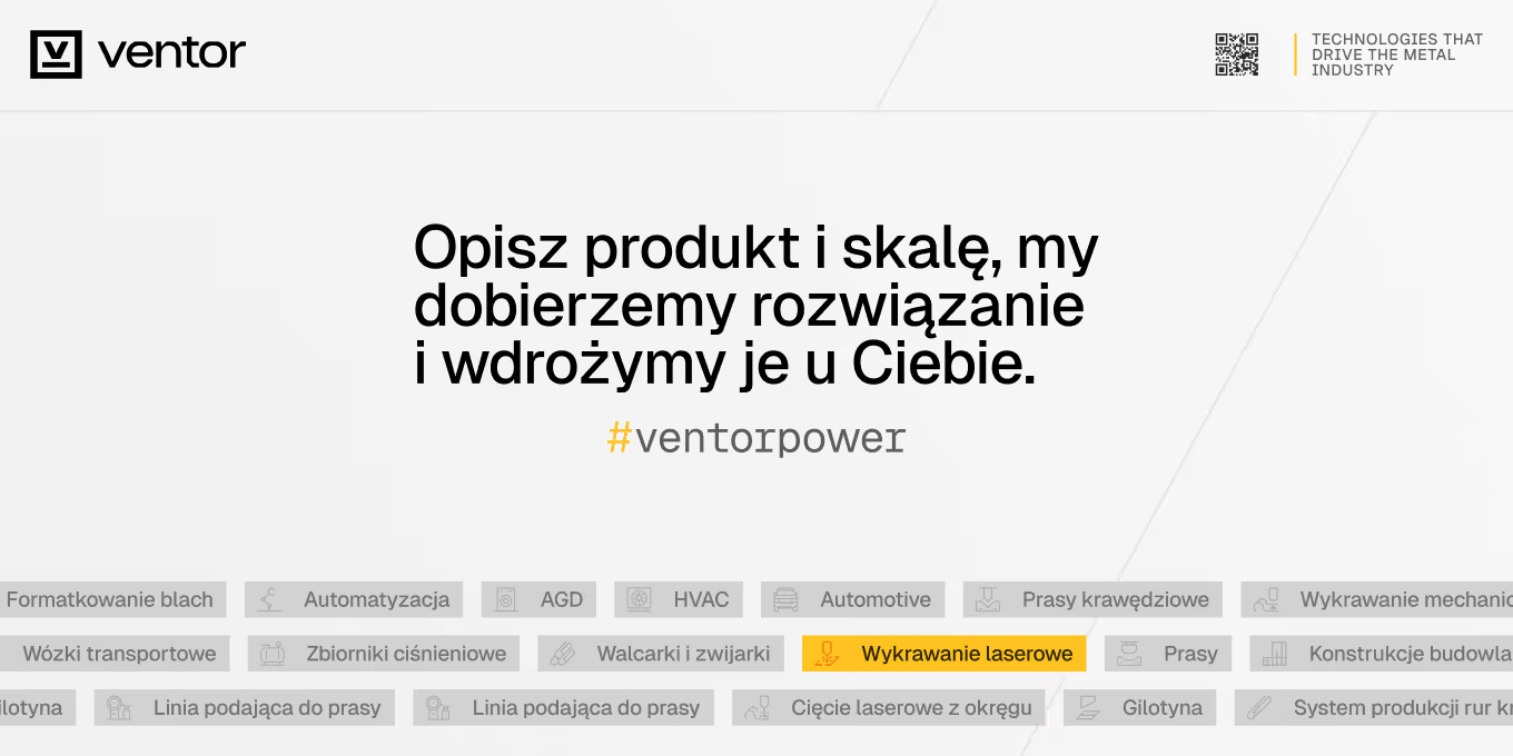
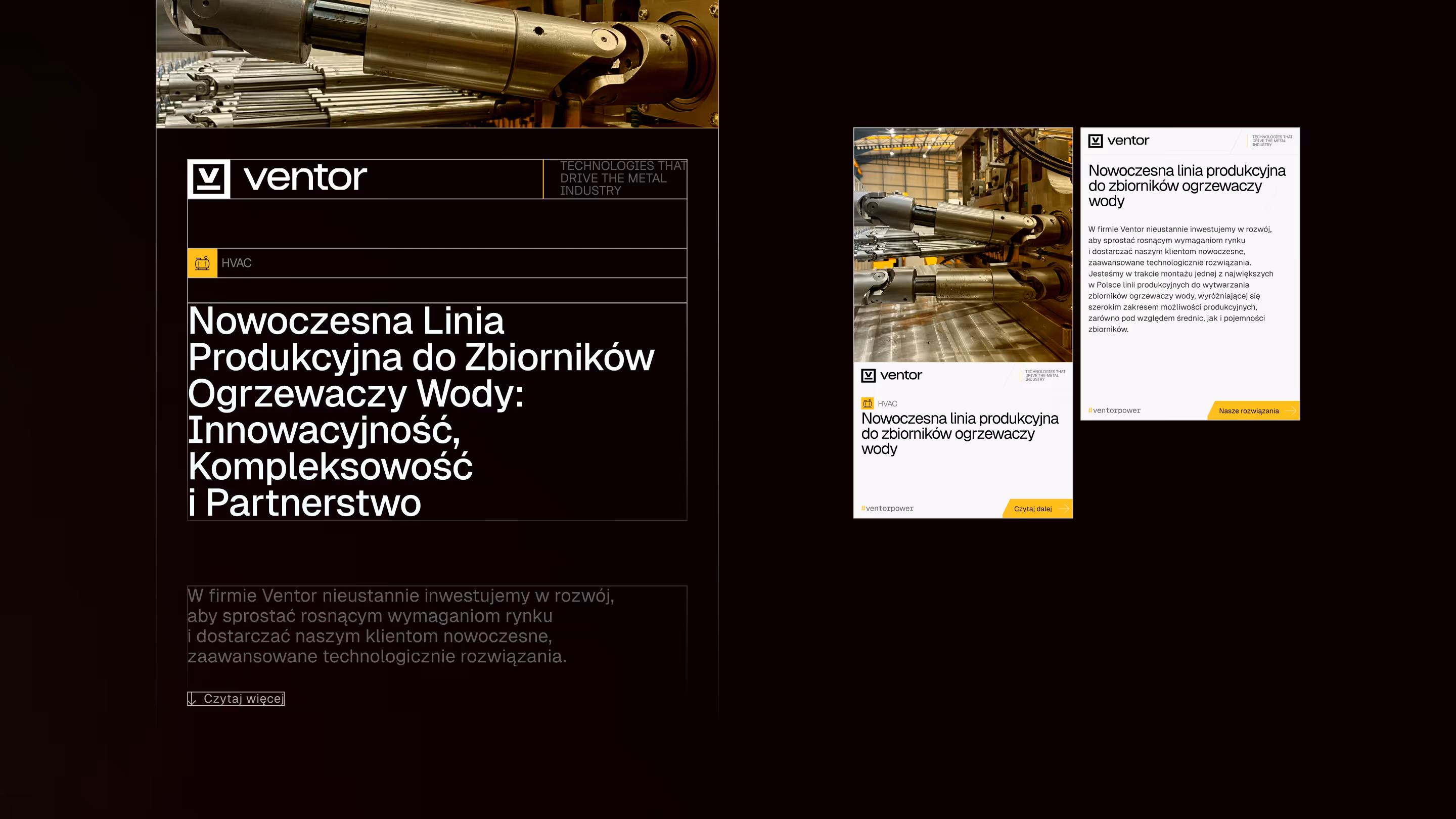
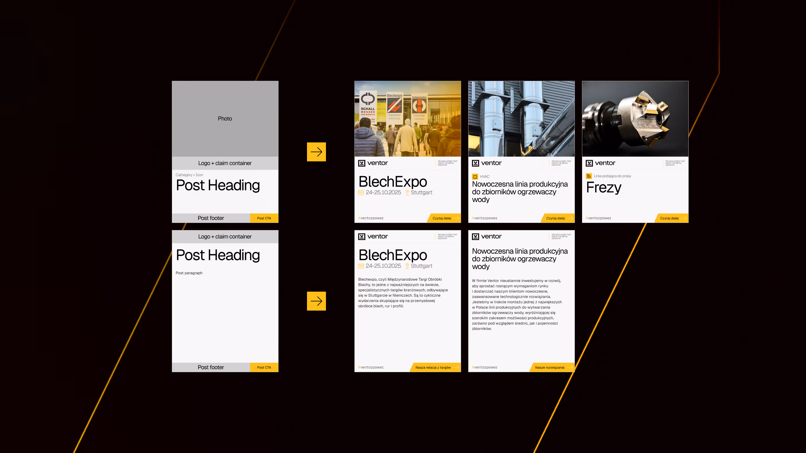
Website
The website had grown over time without clear rules for products, pages, and naming. Some content was outdated or incomplete, and the structure made it hard to understand the offer quickly. There was already a sensible direction in how the site tried to present products and industries, but it needed a stronger system behind it to stay consistent and scalable.
We rebuilt the foundation around two natural ways clients browse:
•
•
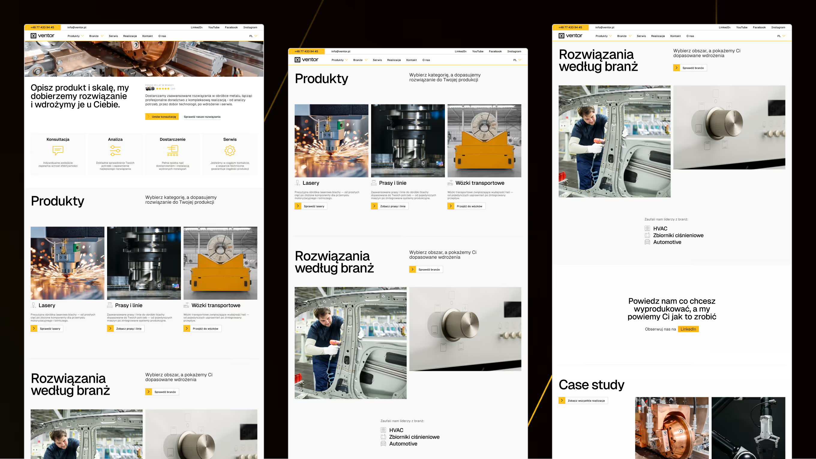
The homepage was designed as a routing page. It directs users to products and industries early, then builds trust through proof such as case studies, customer opinions, service, and clear contact paths. LinkedIn remains Ventor’s primary publishing channel, so the website works as the stable place where the offer and the evidence behind it stay organised and easy to find.
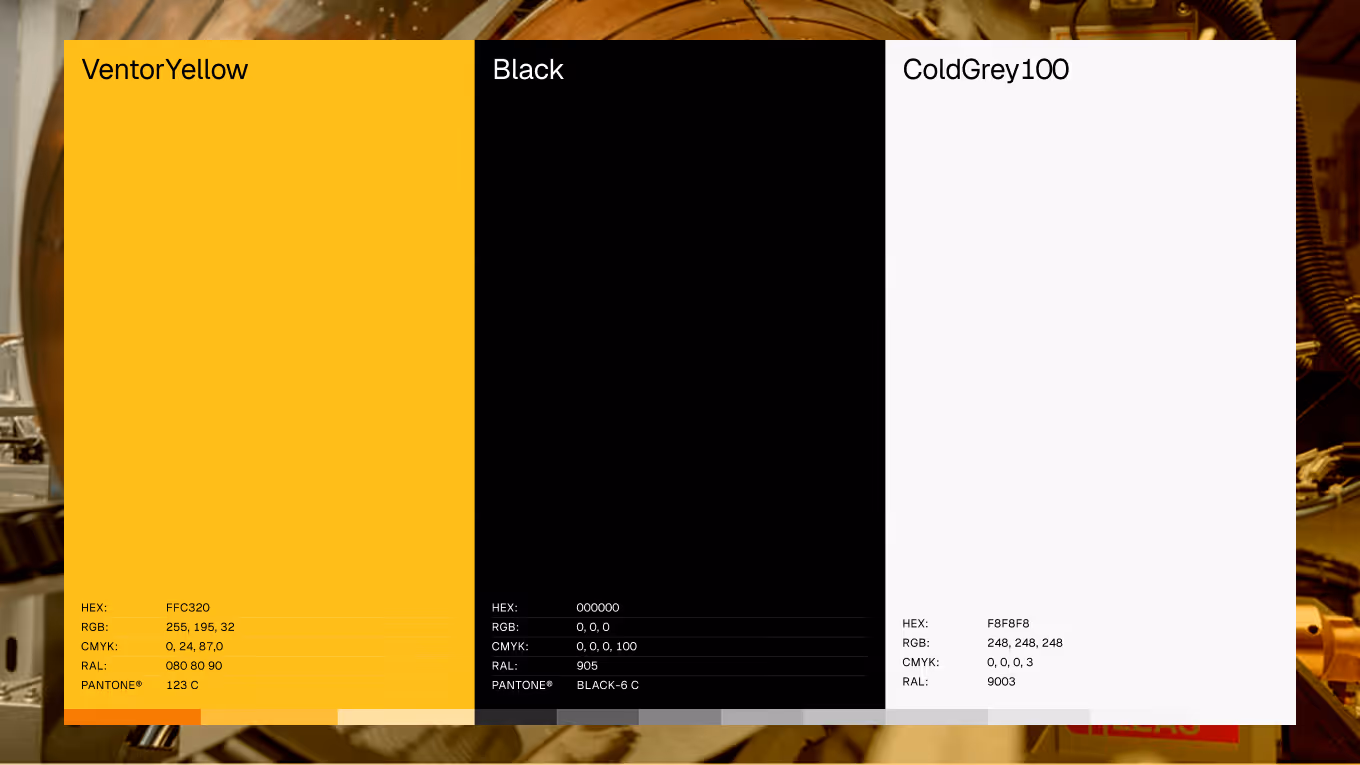
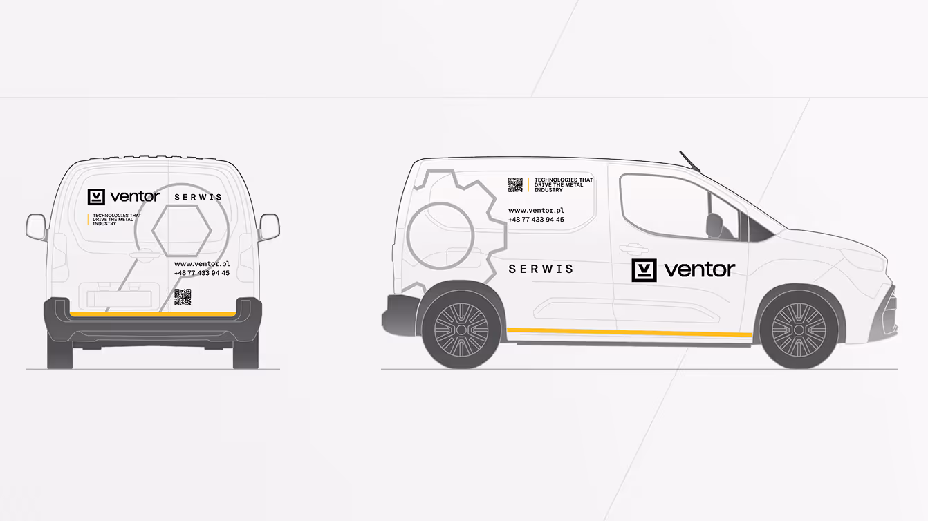
Visual Identity
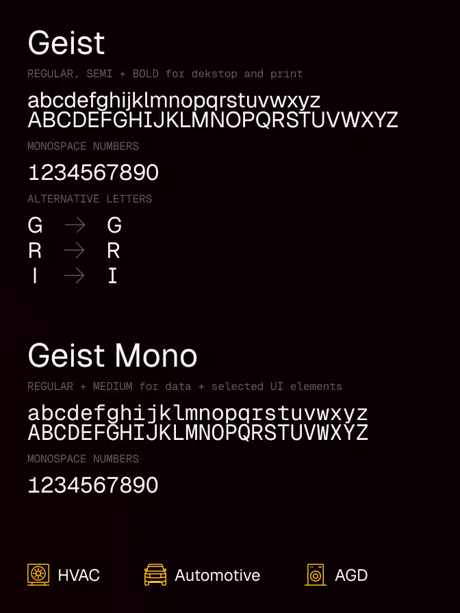
The visual identity was built to stay consistent across formats and teams. It supports technical content and sales communication without becoming heavy or difficult to maintain. Clear rules for colour, typography, and layout help users recognise product groups quickly and keep the brand calm and readable in both digital and print contexts.
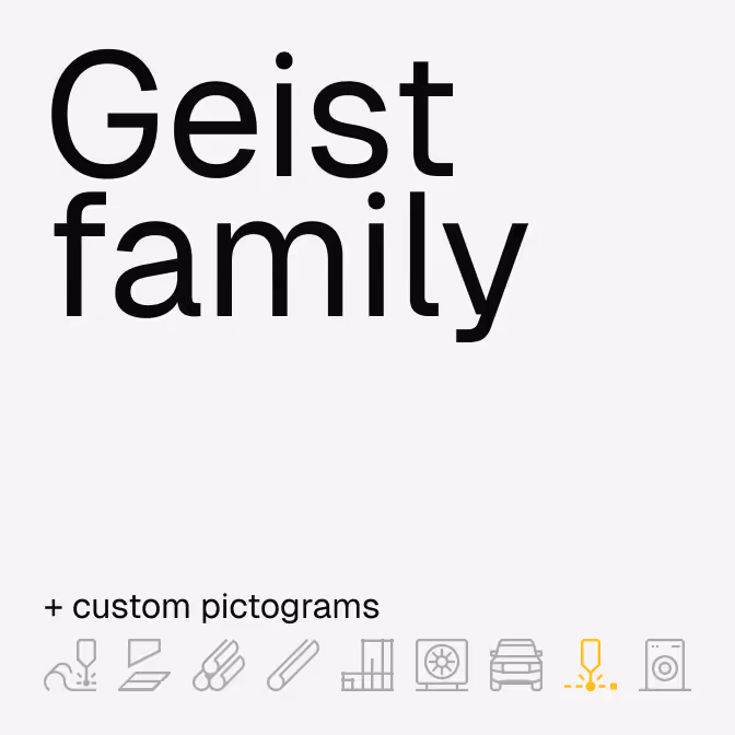
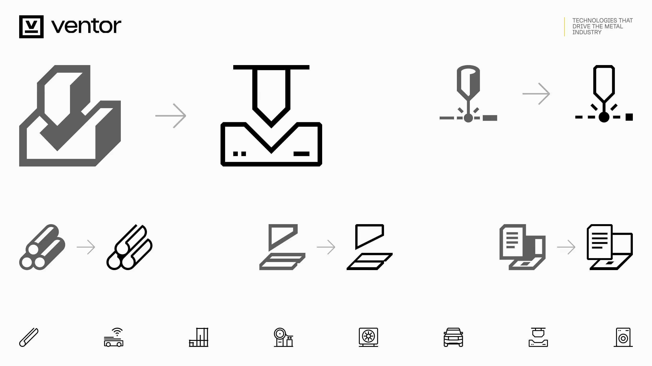
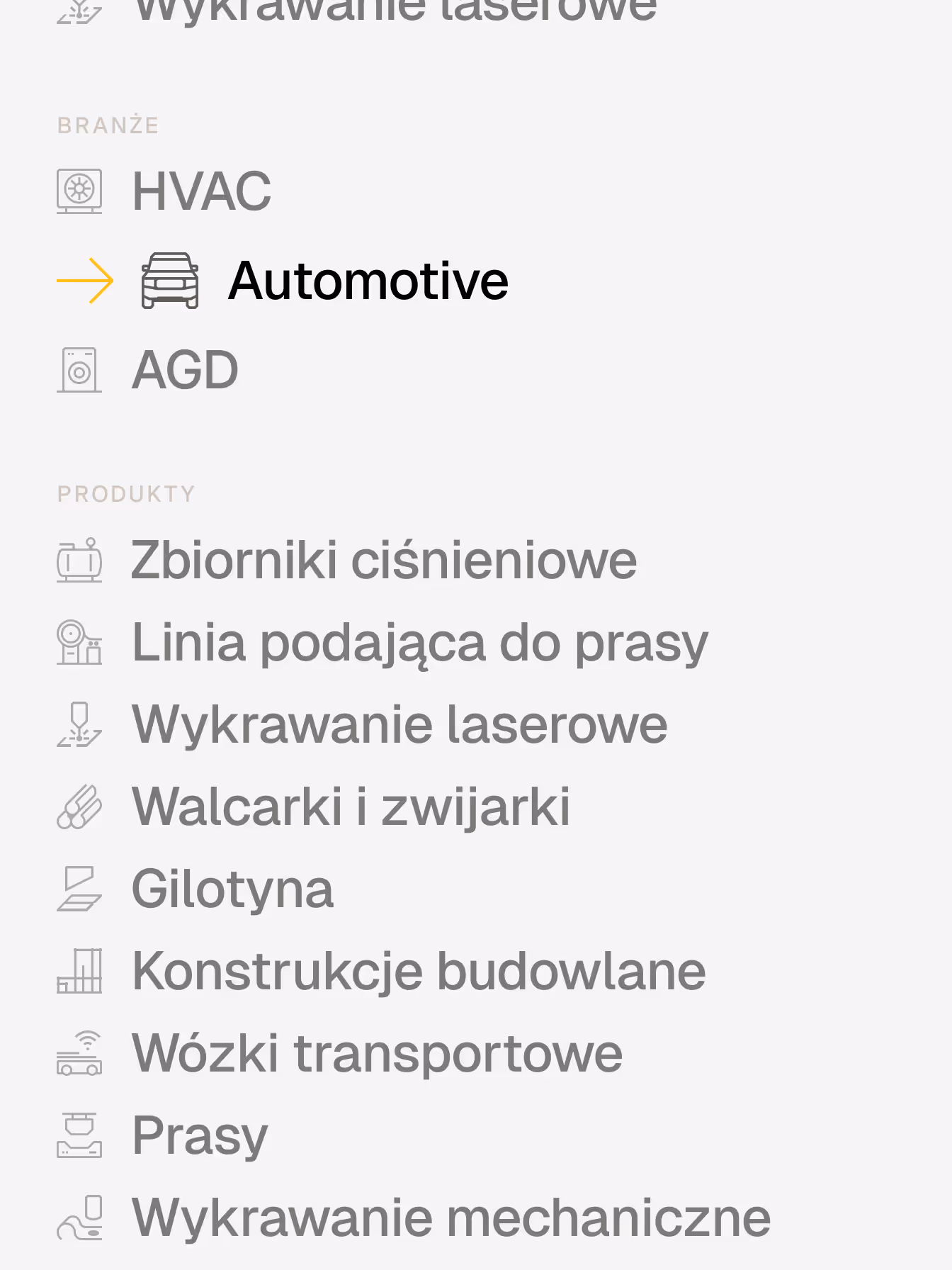
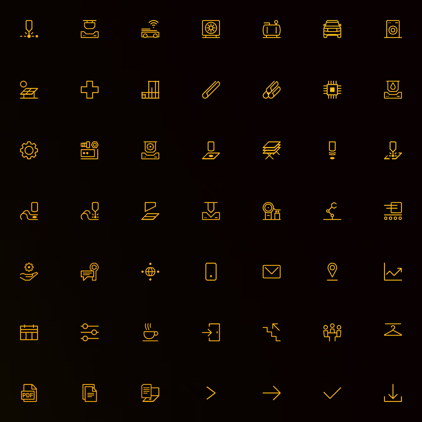
Pictograms
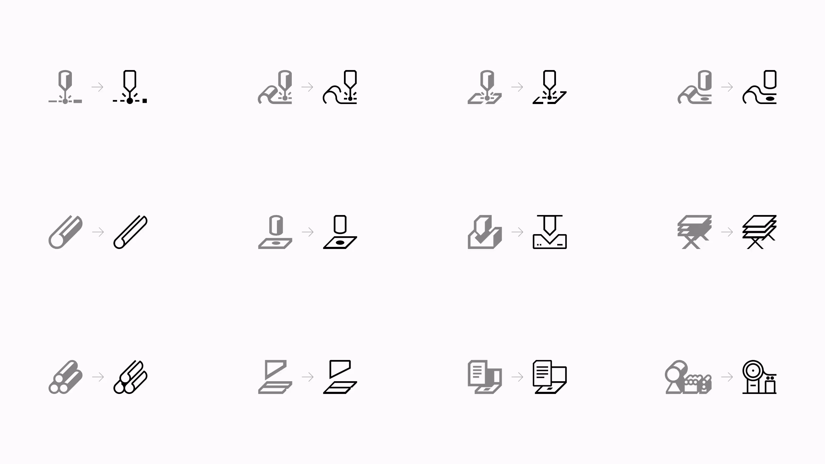
The pictogram system was introduced in 2018 as part of the first Ventor identity work. The original set was designed with a pressed, dimensional feel that referenced metalworking and the physicality of machinery.
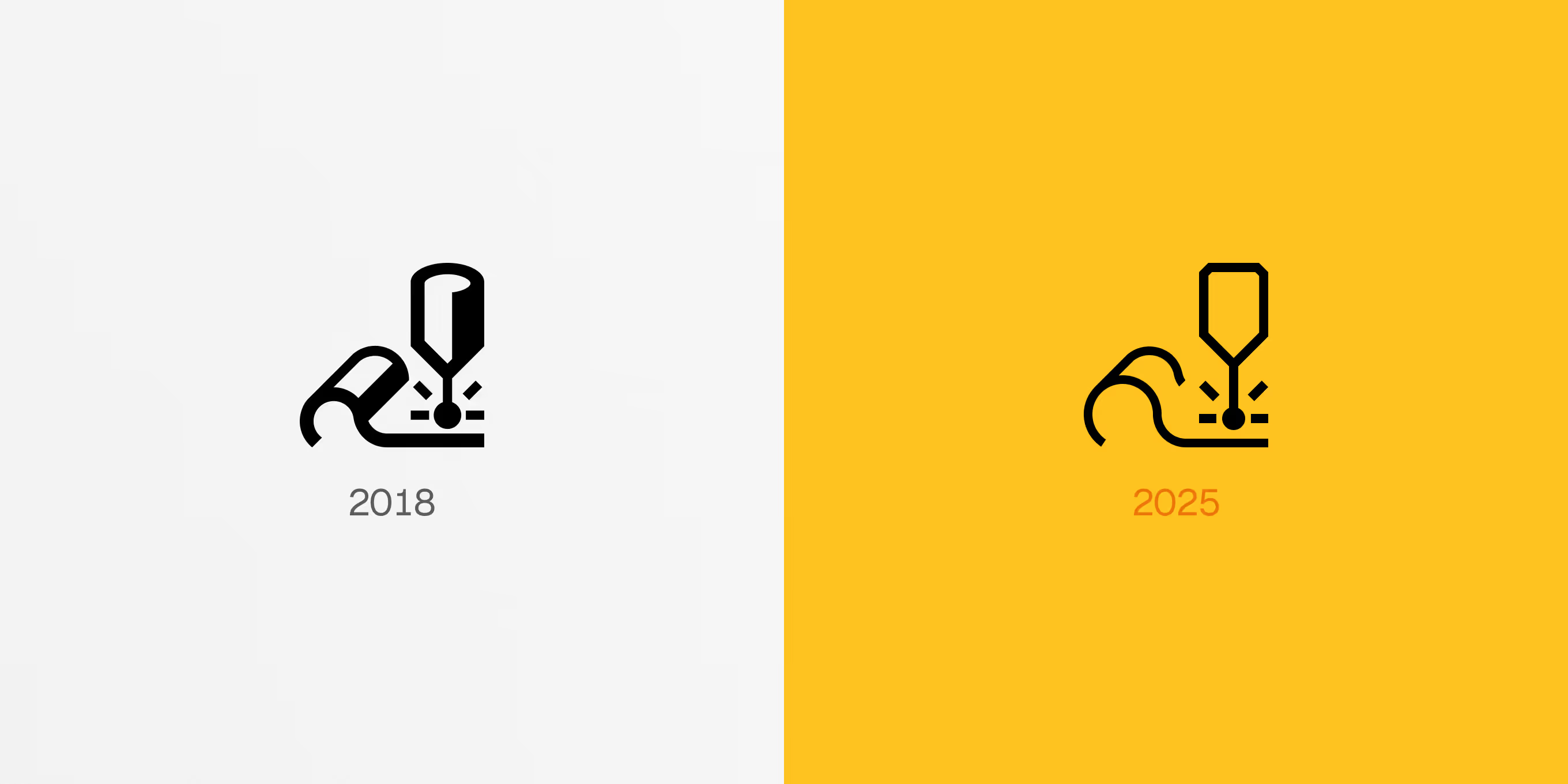
In the refresh, the character was kept where it still made sense, and shapes were simplified where clarity mattered more than depth. Spacing and proportions were refined so the icons stay legible at small sizes and work as a consistent layer for navigation and product communication.
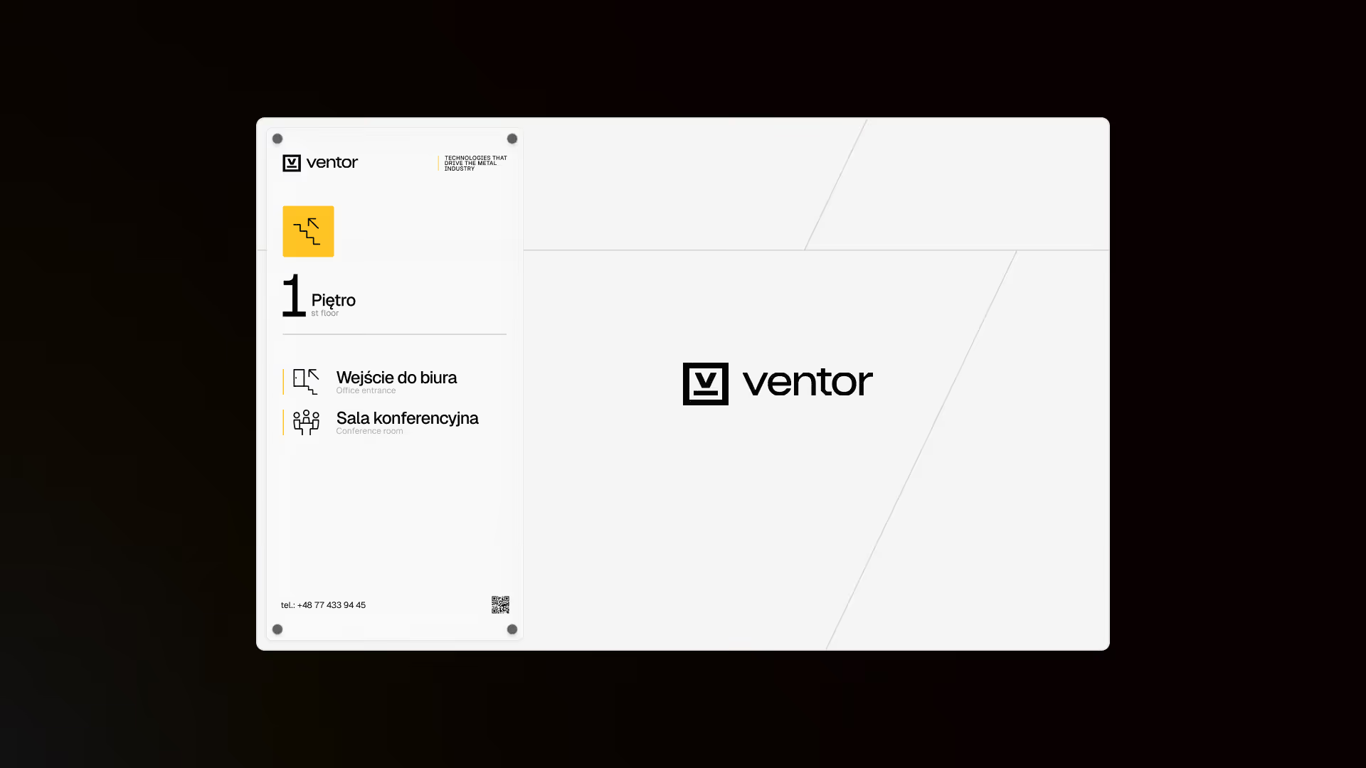
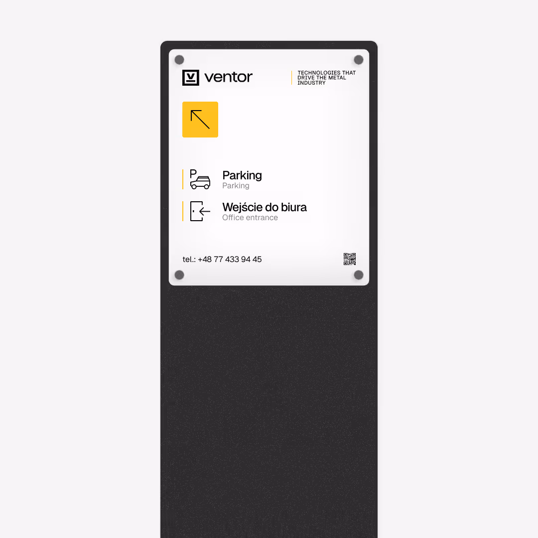
The same visual language was then translated into a simple wayfinding approach, with clear rules that make signage easy to apply and repeat without redesigning each time.